Showing posts with label Van Gogh. Show all posts

Sunday, 20 April 2014

Dissertation and some more dissertation

So for the last two weeks I have stopped doing any art and just concentrated on writing my dissertation. It is a very slow going process since English is not my first language so I often spend time looking at thesaurus trying to find that 'right' word that would describe better what I am trying to communicate.
I have changed a few bits in the overall layout of the paper.

I have also created an updated my project plan (Old one can be found in this blog post  here)showing the areas that I am looking at and how it all ties together (see image below).


I have added an area where I do traditional art and game art analysis; looking at Emotionalism aesthetic theory and how it ties together with brushstrokes visible on a canvas and how these marks not only connects the viewer and the artist but at the same time can contribute to the overall composition of the image. For example like guide the viewer’s eye around the canvas (see image below).


Van Gogh, V. 1889. Starry night. [online image]. Available from: http://en.wikipedia.org/wiki/File:VanGogh-starry_night_ballance1.jpg [Accessed 19 April 2014]


Also been looking about composition in games and so far Botanicula (2012) seem to be performing best (see image below).


Amanita Design. 2012. Botanicula. Microsoft Windows. Amanita Design & Daedalic Entertainment

A spore is spawned repeatedly on the top left-hand corner and is used to deliver a golden key (seen in the picture) to a spot in front of the characters on the bottom right-hand corner. Also the big brown mushroom on the top left-hand corner seems to 'balance' the characters standing at the bottom right-hand corner of the screen. There is also a light coloured white mushroom mirroring the big dark one.


Machinarium (2009) also have some composition elements. It seem to use primarily Golden Cut (see image below).


Amanita Design. 2009. Machinarium. Microsoft Windows. Amanita Design & Daedalic Entertainment

There is a lot action happening around the Golden Cut intersection. For example in this scene the main character Josef is in fiddling with the ventilation system/fan. Also tone wise the dark left-hand side is balanced by the light sky area on the right-hand side. The tower seen in the background is also going straight through the middle of screen.


Another area I am investigating is colour and I think there are some interesting examples how colour can make an asset stand out from the background (see image below).
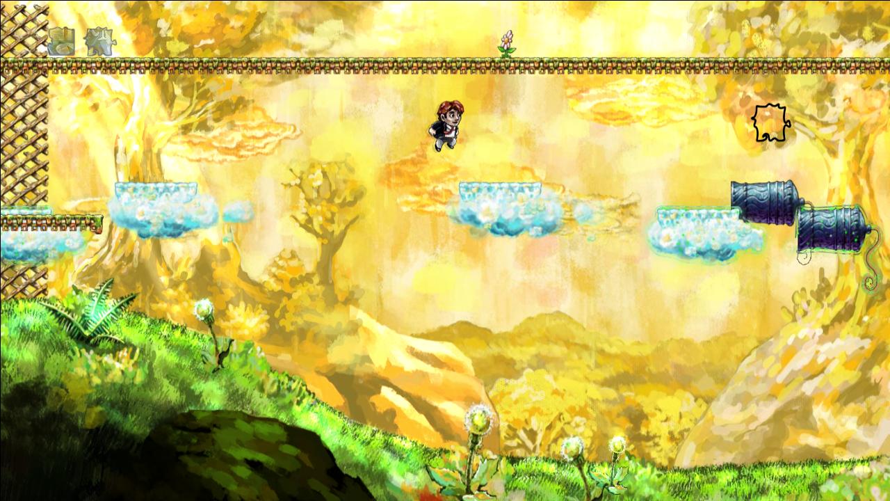


Number None, Inc. 2009. Braid. Microsoft Windows. Number None, Inc


I think in Braid (2008) World 1, the clouds stand out well from the background because of the complementary colour use: yellow-orange (sky, background) is an opposite of blue-green (the interactable cloud platforms).


My supervisor has also suggested that in my dissertation I should talk about the experience of digital painting and how it is different from traditional painting.
I had also had a look at Walter Benjamin book 'The work of art in the age of its technological reproducibility'* as well as Grahame Sullivan book 'Art Practice As Research'**.
B. Walters although talks about printing of artworks and other ways of their mechanical reproduction do related to the Emotionalism aesthetics theory. G. Sullivan’s book was not as useful as I have thought. I did not have too much time to have a really close look at it so perhaps I have missed something. Sadly time is running out fast and I still have many things left to complete before submissions.
I really want to have my dissertation finished by 24th of April because that day I will be going to a library to get help with formatting, referencing and some other things related to dealing with long documents.


On a side note, this Thursday I have went to the Pixel Pushers exhibition at Hannah Maclure Centre and then attended Ian McQue's Masterclass. It was really interesting and I was hoping to get some insights or something really relevant to my project but I feel it was not worth the time as much as I have hoped. I think Jolomo Awards exhibition at HMC earlier this year was more useful.


* Benjamin, W.2008.The work of art in the age of its technological reproducibility and other writings on media.London: The Belknap Press

** Sullivan, G. 2010. Art practice as research : inquiry in visual arts. 2nd ed. London : SAGE

Friday, 25 October 2013

Look at traditional art

Still can not quite work around my head on describing what I am doing for my project this year.

As suggested during my Pitch presentation, I have started looking at some of the traditioanl art and artists that can be relevant on serve as inspiration to my project.

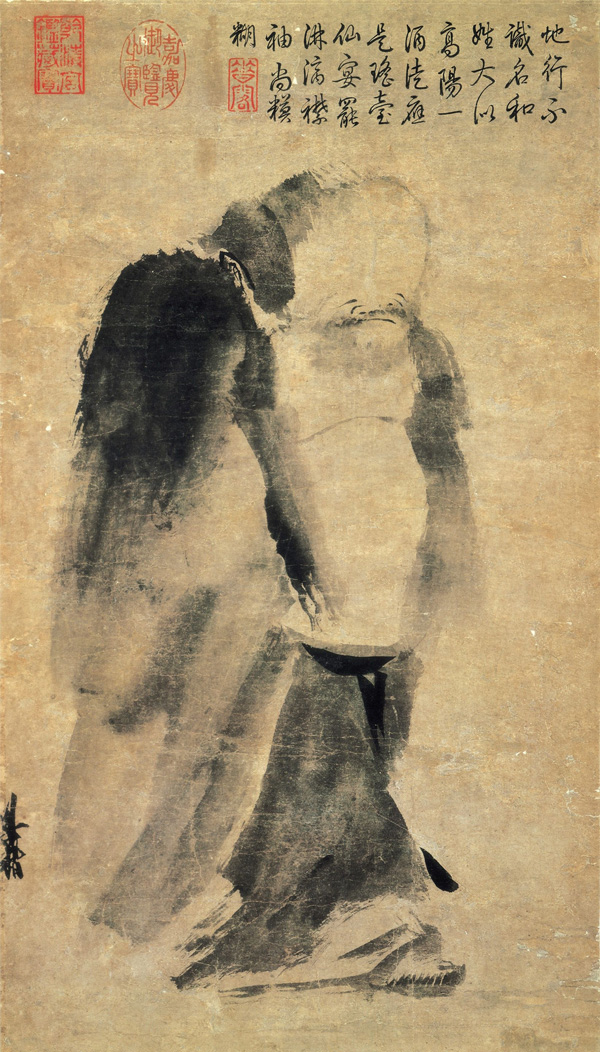
I think one of the things that inspires me is Traditional Chinese ink painting. Mainly because this medium has similar properties to watercolour with which I'm quite familiar. It can have the same minimalistic and ‘translucent’ feel as the watercolour and if successfully used adds the same translucent and ‘flowing’ property to an artwork. Chinese painting seem to have sprung up from calligraphy and is one of the oldest artistic traditions in the world. One of the nice examples of ink and wash painting techniques can be Liang Kai painting Immortal. 


Liang Kai. 1140 - 1210. Immortal in Splashed Ink. [online image]. National Palace Museum, Taipei. Available from: http://www.chinaonlinemuseum.com/painting-liang-kai-immortal-in-splashed-ink.php [Accessed 25 October 2013]

Only few spontaneous brush strokes on paper can give a hint on the texture of fabric folds (light vs. heavy or smooth vs. rough), persons weight  as well as convey mood of the painting.

This type of artwork reminds me somewhat Ōkami (2006) game art.


Joseph Mallord William Turner works are really interesting because of the way he uses colour and light in his paintings. I do like the blurriness of the objects. He manages to convey the atmosphere of the scene.


Turner, J.M.W., 1819. Naples and Vesuvius, from the Hill beneath Certosa di San Martino and Castel Sant'Elmo. [online image] Tate. Available from: https://www.tate.org.uk/art/artworks/turner-naples-and-vesuvius-from-the-hill-beneath-certosa-di-san-martino-and-castel-d16101. [Accessed 25 October 2013]


Turner, J.M.W., 1841. View of Venice - Ducal Palace, Dogana, and San Giorgio. [online image]. Available from: http://commons.wikimedia.org/wiki/File:View_of_Venice_-_Ducal_Palace,_Dogana,_and_San_Giorgio,_by_J._M._W._Turner.jpg. [Accessed 25 October 2013]


Turner, J.M.W., 1844. Rain, Steam and Speed – The Great Western Railway. [online image]. Available from: http://pictify.com/424553/jmw-turner-rain-steam-and-speed-the-great-western-railway. [Accessed 25 October 2013]


I also like the texture of the paintings and find that some of the Braid (2008) backgrounds have that same washed out, quality. I think Turners painting style (oils as well as watercolours) can work really well for game backgrounds: provide enough interests but not overwhelm the foreground game action.


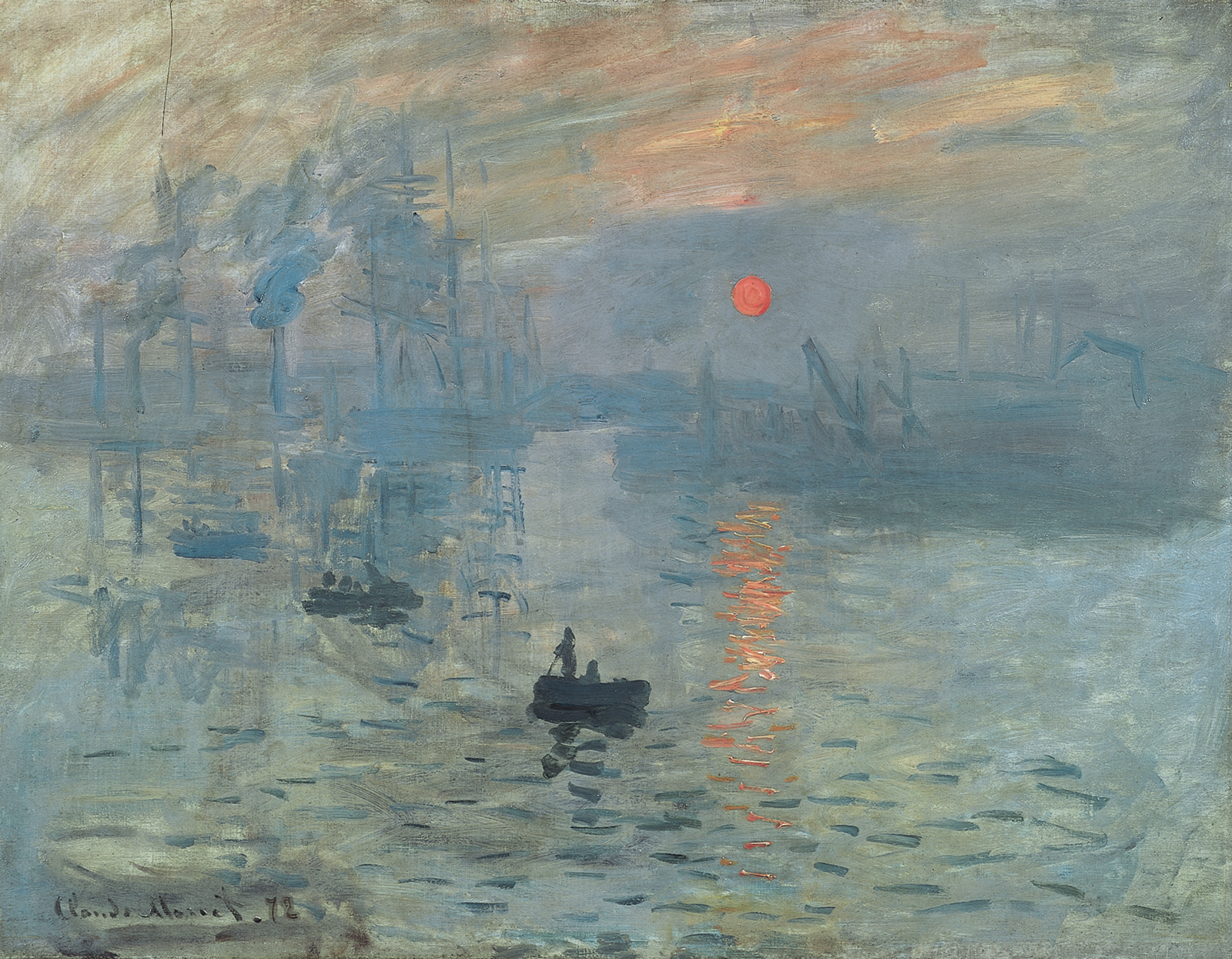
Claude Monet works have a lot of very visible loose brush strokes: typical of impressionist art. What I like about it is the atmosphere that is created by the colour as well as those individual brushstrokes that manage to define things on a canvas without the need for all the detail. This type of painting technique leaves 'space' for the viewers’ interpretation which I think is a nice thing to have. Also brush strokes become individual lines on a canvas that can serve many purposes at the same time: help create mood (flowing lines vs. angled ones), contribute to overall composition as well as serve as an artist signature.


Monet, C. 1897. Arm of the Seine near Giverny. [online image]. Musée d'Orsay, Paris, France. Available from: http://www.claudemonetgallery.org/Arm-Of-The-Seine-Near-Giverny-In-The-Fog2-large.html . [Accessed 25 October 2013]


Monet, C. 1872. Impression, Sunrise. [online image]. Musée Marmottan, Paris, France. Available from: http://en.wikipedia.org/wiki/Impression,_Sunrise . [Accessed 25 October 2013]


David Hellman, Braid (2008) artist, in his blog ( http://www.davidhellman.net/blog/the-art-of-braid-index ) mentioned that he was inspired by impressionists art/artists. I think it is quite evident in final game art style that he created for Braid.


Some of the Isaac Ilyich Levitan landscape paintings are not really done in impressionist style however they seem to convey an impression of him trying to capture nature in a moment.


Isaac Ilyich Levitan. 1898. Sunlit Day a Small Village. [online image]. Tretyakov Gallery, Moscow, Russia. Available from: http://fineartamerica.com/featured/sunlit-day-a-small-village-isaak-ilyich-levitan.html [Accessed 25 October 2013]


Levitan, I. I. 1885. Snowbound Garden 1885. [online image]. Tretyakov Gallery, Moscow, Russia. Available from: http://www.oceansbridge.com/oil-paintings/product/81161/snowboundgarden1885 [Accessed 25 October 2013]


Vincent Van Gogh post-impressionist painter is known for his bold colours, rough and daring brush strokes.


Van Gogh, V. 1889. Starry Night. [online image]. Museum of Modern Art, New York. Available from:  http://www.vangoghgallery.com/painting/starry-night.html [Accessed 25 October 2013]
Technical practise research some videos some of the painters books

In his Starry Night painting swirling brush strokes in the night sky creates motion and keeps viewers eyes moving around the canvas. Also, yellow stars and their halos are juxtaposed against the blueness of the sky.
I think Van Gogh painting style is very tactile, painterly like and it would be very interesting to try and reproduce this traditional art feeling/look in to 2D game art.


Although there are some digital artists/art out there that try to imitate the oils or the watercolours, or some other traditional media, somehow hardly any of it has actually made it in to video games yet. And if this kind of art has a cultural value why not take it and try to apply it somewhere else, especially if it lets people enjoy it more easily and excites their imagination?..


Clover Studio. 2006. Ōkami. PS2. Capcom

Number None, Inc. 2008. Braid. Microsoft Windows. Number None, Inc


I have also started reading Punch, K. P. book  Introduction to Social Research: Quantitative & Qualitative Approaches because I need to find out more about research practises for my proposal document and overall project structure. basically, what I can/need to do to satisfy the research project convention.

* Punch, K. P. 1998. Introduction to Social Research: Quantitative & Qualitative Approaches. London: Sage.