Sunday 27 April 2014

More dissertation writing!

This Thursday had another meeting with Simone. She gave me feedback on my Literature Review part of the dissertation. One of the main reasons of concern was my English grammar. She said she found it hard to follow my dissertation because I had too many grammar mistakes. :( I was a bit surprised because none of my previous lecturers ever mentioned that my English was in such a terrible state. Anyway, I went back to the Student Services if they could do proof reading and at the moment is not clear if they could help me. I will look if any of my friends can have time to read it through but it is highly unlikely as I would imagine everyone is pretty busy with their university work and even if they are not that many people would fancy reading through 9+ K (82 page) word document. I did a quick research online and people charge about £10 per page or per 1000 words. I cannot pay £100 just for proof reading when I already need to print things for exhibition as well as two copies of dissertation and all of these 3-4 weeks before I will become unemployed.
What I did for the rest of the week was fixed all the mistakes in Literature Review and been re-reading every single sentence at least 4 times and trying to fix those grammar mistakes. Also Simone suggested I change the layout of the dissertation and create a section called Contextual Review. So I have done all that and nearly finished writing the entire document. I was really hoping to be done this evening, but looks like I'll have to do some more stuff tomorrow. Need to finish Conclusion and Abstract  parts as well as check again for any grammar mistakes.


Now the Table of Contents looks like this:


LIST OF TABLES......................................................iv
LIST OF FIGURES....................................................v
INTRODUCTION.....................................................1
LITERATURE REVIEW............................................3
Video games and aesthetics........................................3
Art aesthetics relation to videogame visuals................13
CONTEXTUAL REVIEW.......................................17
Composition.............................................................17
Colour.....................................................................26
Brushes and painting techniques................................30
Texture....................................................................34
Handcrafted imperfections........................................36
METHODS..............................................................38
Visual research and critical analysis............................38
Media tests...............................................................40
Critical Framework...................................................45
Case Studies.............................................................47
Braid........................................................................47
Okami......................................................................49
Personal Project.......................................................51
Game design and Pre-production..............................51
Production................................................................55
Critical Framework application.................................58
FINDINGS & EVALUATION................................60
CONCLUSION & FUTURE STUDY.....................62
APPENDICES.........................................................64
Honours Project Supervisor Meeting diary.................65
REFERENCES.........................................................66
FIGURE REFERENCES..........................................71


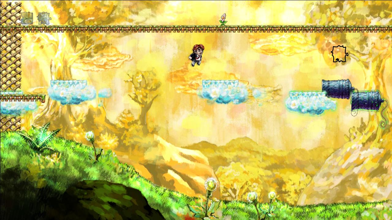
I really cannot afford any more time on the dissertation. I have already spent an extra week on it, which of course came from my practical work slot. :(  I still have to polish a few bits for the environment art, then do UI, character animations and create a gameplay video in adobe After Effects. I do not know how much I can complete it in 2 weeks time. I really hope I can do it all, but most likely I will end up doing more work after the actual submissions are over and probably my neck and back is going to try and kill me again. It is very unnerving and it certainly was not my plan at all. I was going to concentrate on my practical work, therefore my portfolio during this year; especially during this semester.

On Thursday the 1st of May I will have another meeting with Simone. I hope that the feedback regarding my dissertation is going to be somewhat better however... not expecting much good. I just have to live with what is there and fix things after 12th of May submissions.

Sunday 20 April 2014

Dissertation and some more dissertation

So for the last two weeks I have stopped doing any art and just concentrated on writing my dissertation. It is a very slow going process since English is not my first language so I often spend time looking at thesaurus trying to find that 'right' word that would describe better what I am trying to communicate.
I have changed a few bits in the overall layout of the paper.

I have also created an updated my project plan (Old one can be found in this blog post  here)showing the areas that I am looking at and how it all ties together (see image below).


I have added an area where I do traditional art and game art analysis; looking at Emotionalism aesthetic theory and how it ties together with brushstrokes visible on a canvas and how these marks not only connects the viewer and the artist but at the same time can contribute to the overall composition of the image. For example like guide the viewer’s eye around the canvas (see image below).


Van Gogh, V. 1889. Starry night. [online image]. Available from: http://en.wikipedia.org/wiki/File:VanGogh-starry_night_ballance1.jpg [Accessed 19 April 2014]


Also been looking about composition in games and so far Botanicula (2012) seem to be performing best (see image below).


Amanita Design. 2012. Botanicula. Microsoft Windows. Amanita Design & Daedalic Entertainment

A spore is spawned repeatedly on the top left-hand corner and is used to deliver a golden key (seen in the picture) to a spot in front of the characters on the bottom right-hand corner. Also the big brown mushroom on the top left-hand corner seems to 'balance' the characters standing at the bottom right-hand corner of the screen. There is also a light coloured white mushroom mirroring the big dark one.


Machinarium (2009) also have some composition elements. It seem to use primarily Golden Cut (see image below).


Amanita Design. 2009. Machinarium. Microsoft Windows. Amanita Design & Daedalic Entertainment

There is a lot action happening around the Golden Cut intersection. For example in this scene the main character Josef is in fiddling with the ventilation system/fan. Also tone wise the dark left-hand side is balanced by the light sky area on the right-hand side. The tower seen in the background is also going straight through the middle of screen.


Another area I am investigating is colour and I think there are some interesting examples how colour can make an asset stand out from the background (see image below).


Number None, Inc. 2009. Braid. Microsoft Windows. Number None, Inc


I think in Braid (2008) World 1, the clouds stand out well from the background because of the complementary colour use: yellow-orange (sky, background) is an opposite of blue-green (the interactable cloud platforms).


My supervisor has also suggested that in my dissertation I should talk about the experience of digital painting and how it is different from traditional painting.
I had also had a look at Walter Benjamin book 'The work of art in the age of its technological reproducibility'* as well as Grahame Sullivan book 'Art Practice As Research'**.
B. Walters although talks about printing of artworks and other ways of their mechanical reproduction do related to the Emotionalism aesthetics theory. G. Sullivan’s book was not as useful as I have thought. I did not have too much time to have a really close look at it so perhaps I have missed something. Sadly time is running out fast and I still have many things left to complete before submissions.
I really want to have my dissertation finished by 24th of April because that day I will be going to a library to get help with formatting, referencing and some other things related to dealing with long documents.


On a side note, this Thursday I have went to the Pixel Pushers exhibition at Hannah Maclure Centre and then attended Ian McQue's Masterclass. It was really interesting and I was hoping to get some insights or something really relevant to my project but I feel it was not worth the time as much as I have hoped. I think Jolomo Awards exhibition at HMC earlier this year was more useful.


* Benjamin, W.2008.The work of art in the age of its technological reproducibility and other writings on media.London: The Belknap Press

** Sullivan, G. 2010. Art practice as research : inquiry in visual arts. 2nd ed. London : SAGE

Saturday 12 April 2014

UIs of point-and-click adventure games

Since I have been working again on game design and game art I came to a point where I feel I have to have another look at some of the UIs of similar games.

I do not tend to play that many point- and-click adventure games these days but the ones I had a chance to look at are: The Whispered World (2009) and Memoria (2012) by Daedalic Entertainment and Botanicula (2012) and Machnarium (2009) by Amanita Design.

I chose these games because they resemble my game idea for honours year project and I have played them previously.


The Whispered World


The mouse cursor in a non-active state looks like in the image above.


The mouse cursor changes to a 'highlight' state (with a small blue light in the centre) when is placed above an interactable item. (see image above)


When clicked the cursor becomes active and opens up a context related menu where a player can select an action he/she wants to perform. (see image above)


An open inventory is made to look like an open bag/sack. It takes large part of the screen and contains all collected items. (see image above) Also, a general menu is hidden on the top right-hand corner. (see image above) 


When a mouse cursor is moved towards the top right-hand corner the hidden menu reveals itself ( the corner peels away). The mouse cursor functions the same way as during game play: when placed above active item highlights the item in blue as well as lights up blue in the centre. (see image above)


Entrances and exits within the game are marked by a red arrow which appears only when placed above an entrance or exit. (see image above)


I did like a lot the look of inventory as well as the general menu being hidden in the corner of the screen. I think it gives an impression of an illustration; however I think the strange shaped mouse cursor feels a bit strange/unusual. Most likely because the convention in games as well as UI's in general seems to use something that reminds an arrow or a pointing finger. I think it's the shape of it that makes it feel strange at first.


Memoria


This is another game released by Daedalic Entertainment. The developers seem to have changed the mouse cursor design for this game: the cursor takes a more traditional look of an arrow and a pointing finger icon that appears next to it when hovered above an interactable item. (see image below)


Inventory is hidden at the bottom of the screen and moving a mouse cursor to the bottom area reveals it (it slides up when opening and slides down when closing). Also game settings and questbook are located inside inventory (bottom right-hand corner). (see image below)


Botanicula


Very simple UI. Direction and some interactable objects being indicated by an arrow as seen in an image above.


The inventory slides down from the top of the screen and contains collectable cards icon as shown in the top left-hand corner of the screen as well as collectable items displayed at the top right-hand corner of the screen.


Machinarium


The game seems to be using the same Inventory principle as Botanicula (slides up and down when mouse pointer is moved to the top edge of the screen).  Standard mouse cursor in a shape of an arrow and a pointing finger icon when above an interactable object.  The collected objects are displayed on the top left-hand corner.


I think using standard arrow and pointing finger icons avoids confusion and looks very familiar to the player. If something else is used then best if design reminds an arrow or is in some sort of triangle shape. At least this is what I have encountered during my general video game play which is not limited by 2D point-and-click games mentioned in this post.


Amanita Design. 2012. Botanicula. Microsoft Windows. Amanita Design & Daedalic Entertainment
Amanita Design. 2009. Machinarium. Microsoft Windows. Amanita Design & Daedalic Entertainment
Daedalic Entertainment. 2013. Memoria. Microsoft Windows. Deep Silver
Daedalic Entertainment. 2009. The Whispered World. Microsoft Windows. Deep Silver

Sunday 6 April 2014

Work for the showreel

During last 2 weeks I was preparing dissertation and building portfolio website for the end of the year show as I will need to have something online for job hunting as well as business cards. It has been ages since I have done any web development so I took an easy option which took about 4 days to develop; including finding my old work and either taking pictures or scanning. Here is the link to my website www.jurgitarainyteart.me . It is not great but it is better then nothing at all and I will improve it as the time goes by and I have some free time.

I have also created a sketch of the first layer of forest for the land game level (see image below)


Environment: forest area sketch


As I have continued working on the Dissertation I was slowly moving along with the art for the showreel. I have more or less completed the whole environment for the land level. I made some minor changes. One of them is the clouds. I've redrawn them with a pencil brush so the clouds have more 'texture' and stand out better from the sky background.


Environment: forest area


New texture for the clouds.


I have also redesigned the game character Lyse. First version only painterly look and the second one added some white patches on its body. Hopefully to remind somewhat of a moon or stars, as it supposed to be living in the sky.

Lyse: version 1


Lyse: version 2


On Monday I will be submitting a video of the environment and a character walking which I still have to finish it off.