Tuesday 28 January 2014

Investigation of mobile games UIs and Ōkami gameplay as research

Last week I have presented my honours year work to the 4th year GDPM (Game Design & Production Management) students to see if anyone was interested in working together or helping during their free-time. Got a couple of responses and will be meeting them this week.

Also I have been told by my supervisor yesterday that I will need to do a game design or a game concept document if I want to do the art for 2D game assets. It is certainly an issue, because it means I will have to come up with a game idea, game mechanics and then write up a document. How I am going to do all, I have no idea. It is pretty scary and more than ever I feel like collaborating with someone just to help me with the game design. It just feels like my project instead of starting to 'shrink' is actually 'ballooning' out of proportion.  I have already so many things to cover:  fundamentals, colour, game UI, now literature on game design and the actual document and sooooo little time. I am starting to feel relieved that during last semester I made a decision not to code my own game. It is no way I would have had time for any of that. Overall feeling veeerrrrryyyy stressed.

Last week I was unable to get hold of a tablet through university, so decided to play some games on my Andriod mobile phone. Had a look at Google play for some artistic games, but could not find anything that is similar to what I am trying to achieve. I was not stressed about that, as searching for such games is almost like looking for a needle in a haystack. Also I am trying to keep an eye on news whenever I can to see if anything similar has been released. One of the main reasons why I am undertaking this project is the fact that there are so few games that have an interesting or unique art style. Especially trying to imitate somewhat the traditional media.
Research on UI showed that at least portable devices are using assets for UI very sparingly. Especially regarding HUD. Screen space is at a premium when using a small device and no one wants to clutter it with any unnecessary items. Game play, usually is very intuitive and simple. UI is made to stand out from the background  but at the same time made to fit well with the game art style and colour pallets. Interactable objects stand out because of their colour (complementary or cold vs. warm)

Here are some examples of different HUD solutions on portable devices.

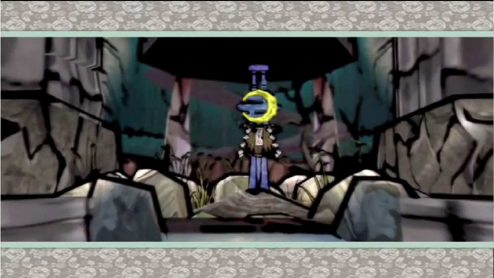
Ubisoft Entertainment. 2014. Rayman Jungle Run. Android. Ubisoft.


Ubisoft Entertainment. 2014. Rayman Jungle Run – Example gameplay (9). [online image]. Google Play. Ubisoft. Available from:
http://www.androidtapp.com/rayman-jungle-run/rayman-jungle-run-example-gameplay-9/ [Accessed 28 January 2014]

As seen in an image above, probably because  most of the game screens have a sky at the top, game designers chose to have yellow icons.  Yellow collour against  blue  is much easier to spot and really stands out, therefore makes it easy for a player to keep an eye on what is happening: how well they are doing.


Another UI example comes from the game Cut the Rope. ZeptoLab have a different aproach with the games HUD. It is very simple and unintrusive as well as fits well with the game design. I would imagine they went for this kind of HUD because ineractable items within the game are brightly coloured therefore having a unintrusive HUD helps with gameplay immersion. (see image below)


ZeptoLab. 2014Cut the Rope FULL FREE.Google playZeptoLab


Unlike some games that perhaps have way too much clutter (including colour clutter) on their screen. I understand that some games are created to be suitable for children, but I  personally feel a bit overhelmed when looking at the Papa Pear Saga's screen.

King.com. 2014. Papa Pear Saga. Google play. King.


I have also borrowed a PS2 from a friend and the Ōkami (2006)* videogame from the library. The main reason for it is the game art style:  inspired by traditional ukiyo-e a woodblock printing as well as ink wash painting techniques. Game designers chose this type of art style because in their opinion it suited best the story they were telling and because it had so much cultural relevance. My intention was to play the game myself and see what choices they have made, how they have dealt with it and hopefully learn something that would benefit my project. Especially because the game is in 3D rather than 2D so I would think it made things more difficult.


My observations  that I had  so far on the art style and design of the game are these:


  • I really liked the art of the intro sequence. Background images, if I was going to be precise. I think it really looks similar to the traditional art and bits of colour (petals) stand out from the almost monochromatic image. I also think the border around the images makes it look more as an illustration image rather than a game screenshot. (see image below) 

However, I do not think that the speech/story bubble looks very pleasing even though it seems to blend well colour wise. To me it looks perhaps slightly messy and out of place. Nevertheless, I think there are much more noticeable things that stand out as being out of place or not too consistent with the artwork presented in the background and that is the characters of the story. They are represented as silhouettes (see images below)


 Orochi 


Shiranui and Nagi


Nagi and Nami
They dont look to bad when presented on their or in pairs, however when placed in a screen with a dragon I think it becomes more difficult to quickly distinguish what is happening on the screen. (see image below)


 Orochi, Shiranui and Nagi


I think the blackness of the silhouettes are overpowering. Also because there is no difference between the characters except the their shapes it is quite hard to pick up what is happening where. I can see that Nagi looks a little more gray then black and I think that was the solution to indicate the fact that he was further away (behind the Shiranui). In my opinion having some colour indication for each character or patterns on the silhouette would have worked much better, but perhaps just like a lot of the games there was lack of time to hit the deadlines and just a silhouette version was chosen to save precious production time. Which in my opinion is understandable but as a player I think I can pick up a subliminal message that tells me somebody perhaps done a 'rush job'.


  • Another thing that bothers me a little is the thickness of the black lines throughout the environment and the characters. (see images below)


I am aware that they are an essential part of the ukiyo-e a woodblock printing technique however there are much more examples where the outlines are not as pronounced as in game. In fact majority of the images have thin and I would say quite delicate lines. (see images below)


 Example of environment.
Hokusai. 19th century. Tsunami. [online image]. Available from: http://commons.wikimedia.org/wiki/File:Tsunami_by_hokusai_19th_century.jpg [Accessed 28 January 2014]


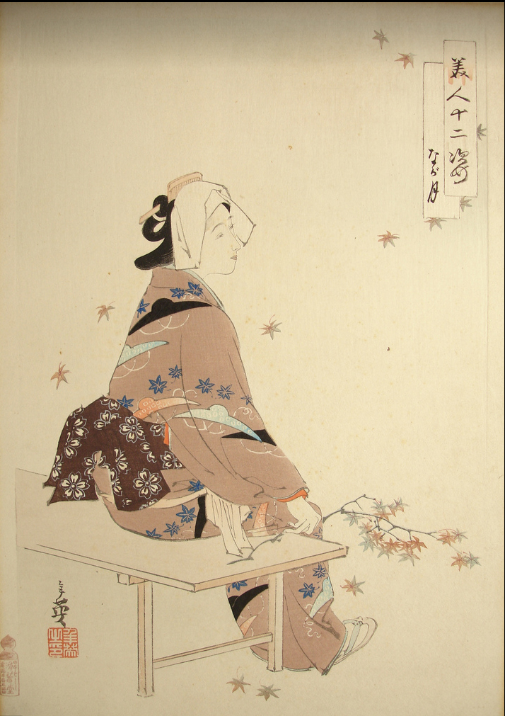
Example of a character

Artist unknown. Early 1900s. Japanese woodcut of Geisha. [online image]. Available from: http://www.flickriver.com/photos/etchingsplus/5751466858/ [Accessed 28 January 2014]


In fact, after quick search I have found only this image that the game art resembled more closely. However, the outlines, still not as tick and not as many as in the games art. Note: ticker lines around the character in the image and much finer lines in environment which is not the case in the game where all lines are the same thickness therefore, in my opinion,  characters do not stand out as much. (see image below)


Example of outlines

Torii Kiyomasu.1690s - 1720. Ichikawa Danjuro I in role of Takenuki Goro. [online image]. Available from: http://en.wikipedia.org/wiki/Torii_Kiyomasu [Accessed 28 January 2014]


  • I think the game has pretty clear HUD in general. (see images below)


Picking up an item


Item goes in to inventory


Map of the area being explored.


Merchant UI also quite clear to see/understand. (see images below)


  • One more thing that I think could have been done better was the main Menu. Some tabs looked a bit cluttered perhaps because of so many colours and the backgroundbeing a little bit crammed: especially on the right hand side. (see image below)


Menu: Inventory


Menu: Brush Techniques


I think Log Book Menu was the most easiest to read visually. Darker background and lighter foreground objects worked really well in my opinion. (see image below)


Menu: Log Book

Also when selected Tabs hardly change their size, therefore for a new player it can be hard to see/understand which tab he/she have selected (see image below). I think a greyed out version or a much larger size would have been a better solution in this case.


Tabs are almost the same size.


You can see menu in detail in this YouTube video posted by SMGSSBBFAN2


During my meeting with my supervisor (Lynn) I have also had time to discuss my idea of interviewing industry professionals to find out about the videogame industry practices in general as well as 2D game asset creation, implementation but most importantly about UI design. I did come to a conclusion that the interview process would probably be too time consuming and the results probably would be worth the time spent. Some of the information I can probably aquire by having a look at how other games conpanies done it and possibly reading about it in books or other gamedesign literature.

I also need to make a much more detailed Semester one Learning Plan/Schedule.


* Clover studio. 2006. Ōkami. Play Station 2. Capcom

Sunday 26 January 2014

List of games that might be relevant to my project 2: Daedalic Entertainment

2D Games

Daedalic Entertainment over the years has released some really nice looking games.
Here is a list of some of them that I think are relevant to my project:

Memoria
Daedalic Entertainment. 2013. Memoria. Microsoft Windows. Deep Silver and Daedalic Entertainment.


Daedalic Entertainment. 2013. [online image]. Available from: http://www.daedalic.de/en/game/memoria [Accessed 26 January 2014]

Memoria is a point-and-click adventure game based on the events of Previous Daedalic Entertainment game ‘Chains of Satinav’. It builds on the previous story and includes puzzles as part of a gameplay. This game is praised for its visual style and quality of the art. Daedalic also boasts on its website that one of the games features is '120 marvellous, hand drawn backgrounds, each breathing life into the game’s world'. Voice acting however seem to be a bit of a letdown unfortunately.


The Dark Eye: Chains of Satinav
Daedalic Entertainment. 2012.The Dark Eye: Chains of Satinav. Microsoft Windows. Deep Silver and Daedalic Entertainment.


Daedalic Entertainment. 2012. [online image]. Available from: http://www.daedalic.de/en/game/DSA_Satinavs_Ketten#5 [Accessed 26 January 2014]

This game is based of The Dark Eye, Europe's best-known role-playing brand that has been around for more than 25 years. TDE: Chains of Satinav is a point-and-click adventure with incorporated puzzles. Story is based in the town/village of Andergast, world of Aventuria. Just like other Daedalic Entertainment games it stands out by having hand drawn/painted artwork.

"Each location has its own distinctive colour palette, instantly creating an atmospheric mood. When you approach a rundown hut in the dark, set against a cloudy sky and decomposing wood backdrop bathed in blues, it’s clear that something sinister is afoot. A harbour town and its dock are made up of browns and greys, bright light shining only from windows, highlighting the poverty that lingers on each corner. The detailed settings draw you in and make the world feel entirely believable, though ambient movement is minimal, sticking to mostly simple things like rising mist or gushing water."*

Fantasy atmosphere  is enriched with music which changes or goes silent as the mood of the game and the story turns 'darker' and more menacing. "A slow, sinister string piece is set against the beating of rain to create a shady atmosphere down at the docks, and when entering a dream world the music becomes ethereal, yet still retaining a strong tension that reminds you of lurking danger." *
However it seems to suffer from the same bad voice acting issue like majority of the other Daedalic Entertainment games.

One of the mentioned game downfalls is a lack of animation or animation being really 'choppy' which takes away from the game and makes it tacky and boring. Lack of emotion in character performance prevents players from bonding with the character and hinders his/hers involvement with the story.*

Also, "... a black loading screen that happens every time you change location or begin a conversation, which snaps you out of the experience for a moment when it should have been done seamlessly (or at least less intrusively)."*


* Keeley, J. 2012. The Dark Eye: Chains of Satinav review. [online].  Adventure Games. Available from: http://www.adventuregamers.com/articles/view/21919 [Accessed 26 January 2014]

In my opinion Joe Keeley made some valid points regarding animations, loading screens and sound. I think it does prove those nice painted images which in this case may resemble nice concept art, book illustration or even animation, is not enough for the game. Since game is interactive and things/characters move around the screen, quality and amount of animation is just as important not only for the 'finished' look/feel but also for payers involvement within the story, world and empathy towards the main character. Also, because sound plays a big role in players immersion quality, its quality is also important. Video game is a really complex system, especially if it attempts to tell a story and each of the game elements and its quality plays important part to the whole.


The Whispered World
Daedalic Entertainment. 2010.The Whispered World. Microsoft Windows. Viva Media  and Lace Mamba.


Daedalic Entertainment. 2010. [online image]. Available from: http://www.daedalic.de/en/game/The_Whispered_World#23 [Accessed 26 January 2014]

The Whispered World is another point-and-click puzzle fantasy adventure game from Daedalic Entertainment. The story is about a young clown called Sadwick and his pet companion Spot. As far as I know, it started its life as a graduation project and after a number of years has been developed in to a finished videogame. It is dialogue heavy and has a good story with some nice characters; however it also suffers a little bit from bad voice acting (English version). Also, just like the rest of Daedalic games, it has that amazing hand painted game art. It certainly reminds a lot of traditional fairy-tale animations with Disney like backgrounds. Actual character animations are not very well done, but not as bad or as noticable as in The Dark Eye: Chains of Satinav.

One of the downfalls of the game from the interactivity point of view are 'hidden' items (collectables, or intractable objects) that can only be found while randomly clicking around the screen. Perhaps making them slightly more visible to a player would make for a better gameplay flow.


A New Beginning
Daedalic Entertainment. 2012. A New Beginning. Microsoft Windows. Daedalic Entertainment.


Daedalic Entertainment. 2012. [online image]. Available from: http://www.daedalic.de/en/game/A_New_Beginning#9 [Accessed 26 January 2014]


A New Begining is described as "a cinematic, interactive adventure-thriller that deals with the defining issue of our time."** It is another point-and-click puzzle adventure however this time players can control two characters: scientist Bent Svensson who's been working on eco-friendly alternative energy source and Fay, a young woman sent from the future to prevent an impending environmental catastrophe.
As a standrad game features detailed, hand-painted backgrounds, however this game also has incorporated an animated graphic-novel story telling "with more than 40 minutes of animated comic book cutscenes".** Art overall looks very similar to the previously mentioned games however not as detailed or painterly as previously. Possibly because there are many characters within the game, developers chose to resemble more comic book art style. Especially, since quite a few scenes feature dialogue (animated faces) and it would have been to consuming to paint everything/everyone in a high detail.

**Daedalic Entertainment. 2014. A New Begining. [online]. Daedalic Entertainment. Available from: http://www.daedalic.de/en/Game/A_New_Beginning [Accessed 26 January 2014]


The Night of the Rabbit
Daedalic Entertainment. 2013. The Night of the Rabbit. Microsoft Windows. Daedalic Entertainment.


Daedalic Entertainment. 2013. [online image]. Available from: http://www.daedalic.de/en/Game/The_Night_of_the_Rabbit [Accessed 26 January 2014]

The Night of the Rabbit is a point-and-click adventure where main character is a 12 year old boy called Jerry who dreams of one day becoming a wizard. Again, this game contains the same art style that reminds more an animation or a book illustration rather than a video game.


Goodbye Deponia
Daedalic Entertainment. 2013.Goodbye Deponia.  Microsoft Windows. Daedalic Entertainment

Chaos on Deponia
Daedalic Entertainment. 2012. Chaos on Deponia. Microsoft Windows. Daedalic Entertainment

Deponia
Daedalic Entertainment. 2012. Deponia. Microsoft Windows. Daedalic Entertainment


Daedalic Entertainment. 2012. [online image]. Available from: http://www.daedalic.de/en/game/Deponia#1 [Accessed 26 January 2014]

Deponia is a series of point-and-click games featuring main characters: Rufus (guy convinced of his own greatness) and Goal (inhabitant upper-class spheres) trying to find their way Elysium and saving junkyard planet Deponia from destruction.

Game art is not that different from most of other Daedalic games, especially The Night of the Rabbit.

I chose to mention these games because it is obvious that developers at Daedalic Entertainment dedicate a lot of attention towards producing games that are nice to look at and have a high quality/standard artwork in them. Also, a lot of players seem to respond really well towards it. It is nice to see that some companies finding time and money to spend on visual side of the game. Although my projects final goal would be to create more painterly look/feel for the game rather than what is seen in Daedalic games examples, I think I can gather a lot of information on how to deal with interactivity and general point-and-click mechanics.

Wednesday 22 January 2014

Progress evaluation so far and next steps for Semester 2

This week is an official Semester 2 start and on Monday I have met with my current supervisor Lynn. During this meeting we were discussing my project; all the work I have done so far as well as talked about my plans for Semester 2.


At the moment I am considering interviewing some local videogame industry professionals about the art for 2D games as well as UI design. I think I could learn some things about it that would help me with my own designs since this is one of my weak areas. Mainly because I am not a game designer and coming up with game mechanics which of course, have a major part in UI design requirements is really hard for me.

However, what this idea means is: if I do decide to seek advice from industry people I will have to reapply to the universities ethic committee for a new approval for my project as well as have to do a lot more paperwork which includes transcribing and analysing recorded interviews. So the question is: is it worth to undertake it considering the results that I’m most likely to get out of it?


I have also been toying with an idea of collaborating with other people. Possibly programmers or game designers to get help with my project as I do realise that my main weaknesses in this project are lack of knowledge about game asset implementation in to a game as well as game design and game mechanics. Last year I did not get lucky to be assigned on to a game design brief and ended up working on an animation brief instead, so the only game developing experience I have so far is from my year two Entertainment Design module which involved a group work on a small Flash game, some projects I have collaborated on as a member of Abertay Game  Developing Society and as a team 'Tartan Paint' member for last years Dare to be Digital competition entry (Can watch pitch video here.) as well as Ludum Dare entry (Can watch project video here and  read development process posts by Stewart Leadingham here.).
I think working with others would help me with the whole development process for this project as the technical or design input would be very beneficial. My supervisor also thought collaboration was a good idea if I felt it would benefit my project. I will look now for some opportunities to see if there is anyone I could collaborate with.


There have also been some changes regarding case studies for my dissertation. So far I have been given advice that Braid (2008)* may not be the most suitable choice as the art style was not the main concern of the Braid designer Jonathan Blow and perhaps Ōkami (2006)* is a much better choice. Since I have never played the game I will be borrowing a copy of it from the universities library to try it out. (Info about these two games you can find in my week 3 blog post.)

Also, this week I need to make a list of questions I would ask about game UI if I was going to interview someone working in the industry as next week I will discuss it with my supervisor to see if the information I am likely to get from it is worth the whole paperwork trouble.

Lynn has also suggested I play some games on a tablet to see how the UI and interaction differs from PC or console games. This would provide me with some information on UI and perhaps help me decide if I want my game (whatever that game will be) be for mobile device or PC or console. Also, study how interaction within games works and how interactive objects are presented on screen. In addition, I should also have a look what other, perhaps similar games to mine are already out there.

Overall, at the moment I feel really stressed and worried as I think I am still lacking knowledge in game design as well as some practical skills. On top of that, all the literature that I feel I need to go through to feel ready for my project seems to look more like a Mount Everest.

I am still making some media tests as I go along with my project as I want to try experimenting more with visual styles to help me decide what I really want my game art to look like.


* Number None, Inc. 2009. Braid. Microsoft Windows. Number None, Inc

** Clover studio. 2006. Ōkami. Play Station 2. Capcom

Sunday 19 January 2014

Semester 1 submission week is over

On Monday I have submitted my Concept Development Document and Pre Production Portfolio as my Semester 1 submission and on Friday handed in my Ethics form.

Still not sure if my Concept Development Document had been written well enough. I do find it hard to talk or pinpoint things that inspire me, because often I am not even sure myself what exactly inspires me. The only way I can describe it is: all inspires me. Things enter my head, stay there while mixing with everything else I have seen, heard or thought about and then it just comes out one way or another. Sometimes I don't think I have control of what happens and how.

Pre Production Portfolio submission was much more forward. I have submitted all the practical work I have done during Semester 1: Photoshop brushes set together with media tests as well as some imaginary game 'screenshots' (see earlier blog posts). I do feel I wish I had more time to complete it all I have intended and the way I have intended but I feel I did not have enough time. I will try and catch up with as much as I can until Semester 2 really kicks in. I feel I need more research on art fundamentals, some more tests in digital painting and design of game UI research but at the same time I wish I had more time to draw and paint rather than read books about these things. However I cannot deny that reading made me understand better my own project. It certainly helped me realize where my project and the research supposed to ‘sit’ within the context of video games and art. Also, in my mind I know how the art for this project supposed to look, but I have not achieved that look yet.

Also, because it takes forever for me to come up with any reasonable ideas for game design I think it would be wise to try and cooperate on this project with someone else. Next Monday will discuss with my tutor possibilities of getting other people (coders or game designers) on board to help me ground this project. I feel I need some sort of structure on what is needed from a technical and design point of view. I think it would give more grounding to my project because I don't feel I have enough experience in developing games (Only year 2 Entertainment Design group project, then Samsug challenge 2013, two semesters of group work as part of Abertay Game Developers society and a peak past peoples shoulders at TAG games.)
All in all I don’t feel confident about starting my work on final peace if I was doing it next week. It does feel as I have not finished preproduction phase yet. I wish I had more hand on experience on game asset production. But perhaps it is just a midyear panic period that I have to move past.

Sunday 12 January 2014

Preparing work for submission week

I have been really busy this week since on Monday is a submission day and I have been working on my Concept Design document and Pre Production portfolio.

Had a meeting on Monday with my mentor and she gave me advice on different ways on how to approach the Concept Design document. I am nearly finished with it and still wonder if what I have written would be satisfactory. Talking about inspiration is always hard for me. I have also followed her advice and took a 'Visual  Culture' book by Richard Howells* from library to help me a little bit in describing some of the art works that I thought were most inspirational for my project so far.

Also this week in between getting things ready for submission I have also managed to complete my last game 'screenshot' that somewhat had been inspired by Jon Klassen art.
(Jon Klassen on Tumblr: http://jonklassen.tumblr.com/ )

The underwater snake has been inspired by a  Lindworm and its head is a direct reference from a pictish stone that is being exhibited at the McManus Art Gallery in Dundee. (See image below)


final layout sketch


final colour version


I am not sure if I am really satisfied with the final result. I think, I should certainly spend more time on the image overall and especially give more attention to the water as well as the stones at the bottom of the sea. It all looks a bit too uniform and boring. Perhaps a slightly different colour scheme would have also worked better. UI is still a very simple one as I did not have time to do any research on this topic yet.

The actual submission deadline is on Monday I will call it finished as I do not have time to do anything else with it.


*    Howells, R. 2003. Visual Culture. Cambridge: Polity
Book is divided in to two parts: Theory and Media.

Theory part mentions a number of theories that can be used to understand and analyse visual text.
Iconology concerns itself with subject-matter or content of visual texts. There are different levels of analysis: like a common sense level but also a symbolic one where symbols are disguised as everyday objects within a visual text. That means that not always 'what-you-see-is-what-you-get'. Some meaning may be hidden from view if the viewer is not familiar with the symbols or their meanings. Also, a visual text has a power of revealing basic attitudes of nation, period, lass, religion etc... all through the work of an artist who communicates it often unconsciously.
Formalism concerns itself with form becoming the meaning of the visual texts therefore it does not concern itself with 'what' is being represented but 'how'. This theory is great for analysis of modern and abstract art with no subject matter. It uses 5 points of analysis (1. the rhythm of the line, 2. mass, 3. space, 4. light and shade, 5. colour) in communication of emotion through visual art.
Traditional art history. Art and artist should be analysed within the context of the history because history and art knowledge influenced art evolution. Also, it influences nowadays the commercial value of an artwork, where value can be created for a piece of art if it's tought that it has been created by someone famous.
Ideology investigates ideological approaches to analysis of visual culture. It suggests that visual texts as cultural texts inevitably betray the values of the cultures in which they were created. Also, some theorist (Berger) claim that art experts deliberately obscure the visual evidence of the past in order to justify the politics of the present.
Semiotic theory can also be useful in analysis of visual culture. It analyses connection between sign, signifier and signified. It suggests that signifier can be interpreted as an empty vessel until it is filled with meaning in order to signify. (e.g. advertisements that don't sell sell the product but a lifestyle)
Hermeneutic analyses interpretative approach which acknowledges that there are differences between literal and intended meaning therefore there can be plenty of ambiguity within visual text. It also suggests that there is a connection between education and culture: culture grows and changes.

Media part of the book is concerned with representation of reality within fine art, photography, film and TV as well as discusses if  'new media' is actually that new or is it only a different systems to deliver what is already there (e.g. still and moving images etc.)

Actually I did found this book useful and now after reading it properly I find myself analysing more not only visual text but everything else for 'hidden' meanings. It certainly made me 'see' more then before.

Sunday 5 January 2014

Reworking old game art ideas 3

I am back to reworking old game ideas and this time using a lot of my own brushes.


Here are some sketches that I did  while testing my brushes:


Pencil and Watercolour tests


Watercolour and Ink tests


Oil/Acrylic paints tests


And here is mock-up 'screenshots’ for the games:

Fianna

As I have mentioned in my previous post (week 7) I have decided to move back to using bright colours inspired by the original The Book of Kells (can also view it online at http://digitalcollections.tcd.ie/home/index.php by using search option ) and also re-watched The Secret of Kells (2009)* animation to see how they dealt with the art style that was also was inspired by the actual The Book of Kells. 


Columba, Saint (521-597) and Jones, Henry (1605-1682). The Book of Kells: Gospel of Matthew, Portrait of Christ. [online image]. Manuscripts & Archives Research Library, Trinity College Dublin. Available from : http://digitalcollections.tcd.ie/home/index.php [Accessed 5 January 2014]


The Secret of Kells. 2009. [online image] Available from: http://c8six.blogspot.co.uk/2010/10/secret-of-kells.html [Accessed 5 January 2014]


Here is an image of work in progress with some colour reference (bottom right-hand corner) and changes to the background texture where I have tried imitating an old paper texture.


And here is a final image I came up with.


I think my new brush set definitely helped in producing a more of traditional media look, however the colour scheme and artwork ended up looking like the one from ‘The Secret of Kells’ animation even though it was not my intention. I think trying to replicate really closely actual Celtic art that can be seen in the real book of Kells is way too complicated, time consuming and possibly will not read well at all on a screen particularly for a game where player needs to see and understand what’s happening. If I was trying to do this type of art for my honours project I will need to really re-thing and re-design as well as test it more if it can work at all.
Conclusion: too complex and time consuming, won’t be using this art style for final production.


Books used for image references:

Bain, G. 1977. Celtic art: the methods of construction. Glasgow: Wm Maclellan Publisher

Courtney, D. 1988. The celtic art source book. Blandford.

Meehan, A. 1995. The dragon and the griffin: the Viking impact. Thames and Hudson

Meehan, A. 1995. The tree of life. Thames and Hudson


Dragonfly Dash

I've tried once  more to test the watercolour media look using a side view and see what I can do with the background plants: I wanted them to have that flowy watercolour look.


After considering art style from the actual gameplay view I have realised that it might be too confusing for a player to view it this way, as the background will get in a way: draw some unnecessary attention. Therefore, I have reverted back to the top down view and here is my final result.


I have used my custom brushes to create the final image: including the plant brush visible on a background). I think it looks much better than a previous attempt.  The player would have a feeling that there are certainly some plants below the flowers but the cool colour of the background makes it non-obtrusive. Flowers (obstacles which have to be avoided by the dragonfly) stand out well enough from the background by having warm and bright colours (reds, yellows) and the actual insects are black. Dragonfly is different from the other insects (dragonflies food) as it has red eyes and is much larger in size. Red trail drawn using stylus or finger shows the path it will travel.

The game art style design has traditional media look as I have used images of real ink stains on paper and converted them in to Photoshop brushes (the base of poppy flowers).

I think this game art version looks nice and could be taken foreword through in to semester 2 of my honours project.


NoBoy

Instead of continuing with my idea of an orchard I have decided to try an underwater scene instead.

Here is a thumbnail image of my initial idea for environment and character I have scribbled on my mobile phone.


Here is my first stage where I also tried applying a Bas Relief  filter effect (a technique I have found out about in one of the Digital Masters books) to create paint on canvas  texture. I was trying to imitate texture of traditional paint on canvas. See example image in my week 8 post by Alexander Sigov.

First version without the filter effect.


Second version with the filter added and layered on top of the original painting where you can see the texture somewhat reminiscent of paint brush texture created on canvas.


And here is a final image I was able to create.


I am really happy with the outcome. I think the Bas Relief  filter effect really adds to the traditional media look. I have changed the underwater plants slighlty: used different colour and black outline to indicate them as interactable objects. The main character supposed to have come from the stars, therefore I have created a 'star' brush and used it to add pattern on its body and that way show that he was not a regular creature. It also has a black outline since it falls in to the same 'interactable object' category and it was logical to make it stand out from the backgound. What I do realised now is that I need to look in to the game design and UI (User Interface) design in particular as I find it really hard to come up  with the game design logics and interaction therfore design suitable HUD (Head-up Display).


*  The Secret of Kells. 2009. [animated film]. Directed by Tomm Moore. Belgium, Ireland and France: Les Armateurs Vivi Film, France 2 Cinéma, Canal +, Cartoon Saloon.