Showing posts with label Ōkami. Show all posts

Tuesday, 28 January 2014

Investigation of mobile games UIs and Ōkami gameplay as research

Last week I have presented my honours year work to the 4th year GDPM (Game Design & Production Management) students to see if anyone was interested in working together or helping during their free-time. Got a couple of responses and will be meeting them this week.

Also I have been told by my supervisor yesterday that I will need to do a game design or a game concept document if I want to do the art for 2D game assets. It is certainly an issue, because it means I will have to come up with a game idea, game mechanics and then write up a document. How I am going to do all, I have no idea. It is pretty scary and more than ever I feel like collaborating with someone just to help me with the game design. It just feels like my project instead of starting to 'shrink' is actually 'ballooning' out of proportion.  I have already so many things to cover:  fundamentals, colour, game UI, now literature on game design and the actual document and sooooo little time. I am starting to feel relieved that during last semester I made a decision not to code my own game. It is no way I would have had time for any of that. Overall feeling veeerrrrryyyy stressed.

Last week I was unable to get hold of a tablet through university, so decided to play some games on my Andriod mobile phone. Had a look at Google play for some artistic games, but could not find anything that is similar to what I am trying to achieve. I was not stressed about that, as searching for such games is almost like looking for a needle in a haystack. Also I am trying to keep an eye on news whenever I can to see if anything similar has been released. One of the main reasons why I am undertaking this project is the fact that there are so few games that have an interesting or unique art style. Especially trying to imitate somewhat the traditional media.
Research on UI showed that at least portable devices are using assets for UI very sparingly. Especially regarding HUD. Screen space is at a premium when using a small device and no one wants to clutter it with any unnecessary items. Game play, usually is very intuitive and simple. UI is made to stand out from the background  but at the same time made to fit well with the game art style and colour pallets. Interactable objects stand out because of their colour (complementary or cold vs. warm)

Here are some examples of different HUD solutions on portable devices.

Ubisoft Entertainment. 2014. Rayman Jungle Run. Android. Ubisoft.


Ubisoft Entertainment. 2014. Rayman Jungle Run – Example gameplay (9). [online image]. Google Play. Ubisoft. Available from:
http://www.androidtapp.com/rayman-jungle-run/rayman-jungle-run-example-gameplay-9/ [Accessed 28 January 2014]

As seen in an image above, probably because  most of the game screens have a sky at the top, game designers chose to have yellow icons.  Yellow collour against  blue  is much easier to spot and really stands out, therefore makes it easy for a player to keep an eye on what is happening: how well they are doing.


Another UI example comes from the game Cut the Rope. ZeptoLab have a different aproach with the games HUD. It is very simple and unintrusive as well as fits well with the game design. I would imagine they went for this kind of HUD because ineractable items within the game are brightly coloured therefore having a unintrusive HUD helps with gameplay immersion. (see image below)


ZeptoLab. 2014Cut the Rope FULL FREE.Google playZeptoLab


Unlike some games that perhaps have way too much clutter (including colour clutter) on their screen. I understand that some games are created to be suitable for children, but I  personally feel a bit overhelmed when looking at the Papa Pear Saga's screen.

King.com. 2014. Papa Pear Saga. Google play. King.


I have also borrowed a PS2 from a friend and the Ōkami (2006)* videogame from the library. The main reason for it is the game art style:  inspired by traditional ukiyo-e a woodblock printing as well as ink wash painting techniques. Game designers chose this type of art style because in their opinion it suited best the story they were telling and because it had so much cultural relevance. My intention was to play the game myself and see what choices they have made, how they have dealt with it and hopefully learn something that would benefit my project. Especially because the game is in 3D rather than 2D so I would think it made things more difficult.


My observations  that I had  so far on the art style and design of the game are these:


  • I really liked the art of the intro sequence. Background images, if I was going to be precise. I think it really looks similar to the traditional art and bits of colour (petals) stand out from the almost monochromatic image. I also think the border around the images makes it look more as an illustration image rather than a game screenshot. (see image below) 

However, I do not think that the speech/story bubble looks very pleasing even though it seems to blend well colour wise. To me it looks perhaps slightly messy and out of place. Nevertheless, I think there are much more noticeable things that stand out as being out of place or not too consistent with the artwork presented in the background and that is the characters of the story. They are represented as silhouettes (see images below)


 Orochi 


Shiranui and Nagi


Nagi and Nami
They dont look to bad when presented on their or in pairs, however when placed in a screen with a dragon I think it becomes more difficult to quickly distinguish what is happening on the screen. (see image below)


 Orochi, Shiranui and Nagi


I think the blackness of the silhouettes are overpowering. Also because there is no difference between the characters except the their shapes it is quite hard to pick up what is happening where. I can see that Nagi looks a little more gray then black and I think that was the solution to indicate the fact that he was further away (behind the Shiranui). In my opinion having some colour indication for each character or patterns on the silhouette would have worked much better, but perhaps just like a lot of the games there was lack of time to hit the deadlines and just a silhouette version was chosen to save precious production time. Which in my opinion is understandable but as a player I think I can pick up a subliminal message that tells me somebody perhaps done a 'rush job'.


  • Another thing that bothers me a little is the thickness of the black lines throughout the environment and the characters. (see images below)
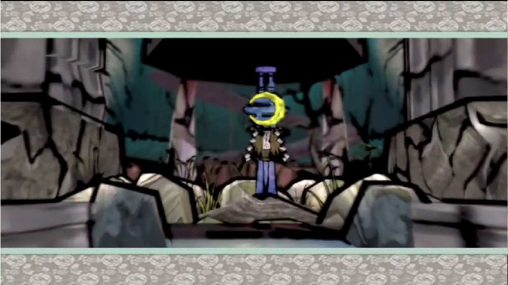


I am aware that they are an essential part of the ukiyo-e a woodblock printing technique however there are much more examples where the outlines are not as pronounced as in game. In fact majority of the images have thin and I would say quite delicate lines. (see images below)


 Example of environment.
Hokusai. 19th century. Tsunami. [online image]. Available from: http://commons.wikimedia.org/wiki/File:Tsunami_by_hokusai_19th_century.jpg [Accessed 28 January 2014]
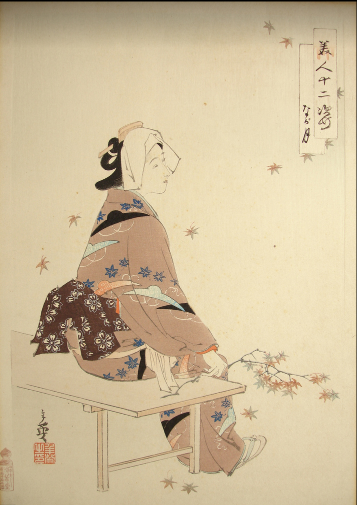


Example of a character

Artist unknown. Early 1900s. Japanese woodcut of Geisha. [online image]. Available from: http://www.flickriver.com/photos/etchingsplus/5751466858/ [Accessed 28 January 2014]


In fact, after quick search I have found only this image that the game art resembled more closely. However, the outlines, still not as tick and not as many as in the games art. Note: ticker lines around the character in the image and much finer lines in environment which is not the case in the game where all lines are the same thickness therefore, in my opinion,  characters do not stand out as much. (see image below)


Example of outlines

Torii Kiyomasu.1690s - 1720. Ichikawa Danjuro I in role of Takenuki Goro. [online image]. Available from: http://en.wikipedia.org/wiki/Torii_Kiyomasu [Accessed 28 January 2014]


  • I think the game has pretty clear HUD in general. (see images below)


Picking up an item


Item goes in to inventory


Map of the area being explored.


Merchant UI also quite clear to see/understand. (see images below)


  • One more thing that I think could have been done better was the main Menu. Some tabs looked a bit cluttered perhaps because of so many colours and the backgroundbeing a little bit crammed: especially on the right hand side. (see image below)


Menu: Inventory


Menu: Brush Techniques


I think Log Book Menu was the most easiest to read visually. Darker background and lighter foreground objects worked really well in my opinion. (see image below)


Menu: Log Book

Also when selected Tabs hardly change their size, therefore for a new player it can be hard to see/understand which tab he/she have selected (see image below). I think a greyed out version or a much larger size would have been a better solution in this case.


Tabs are almost the same size.


You can see menu in detail in this YouTube video posted by SMGSSBBFAN2


During my meeting with my supervisor (Lynn) I have also had time to discuss my idea of interviewing industry professionals to find out about the videogame industry practices in general as well as 2D game asset creation, implementation but most importantly about UI design. I did come to a conclusion that the interview process would probably be too time consuming and the results probably would be worth the time spent. Some of the information I can probably aquire by having a look at how other games conpanies done it and possibly reading about it in books or other gamedesign literature.

I also need to make a much more detailed Semester one Learning Plan/Schedule.


* Clover studio. 2006. Ōkami. Play Station 2. Capcom

Wednesday, 22 January 2014

Progress evaluation so far and next steps for Semester 2

This week is an official Semester 2 start and on Monday I have met with my current supervisor Lynn. During this meeting we were discussing my project; all the work I have done so far as well as talked about my plans for Semester 2.


At the moment I am considering interviewing some local videogame industry professionals about the art for 2D games as well as UI design. I think I could learn some things about it that would help me with my own designs since this is one of my weak areas. Mainly because I am not a game designer and coming up with game mechanics which of course, have a major part in UI design requirements is really hard for me.

However, what this idea means is: if I do decide to seek advice from industry people I will have to reapply to the universities ethic committee for a new approval for my project as well as have to do a lot more paperwork which includes transcribing and analysing recorded interviews. So the question is: is it worth to undertake it considering the results that I’m most likely to get out of it?


I have also been toying with an idea of collaborating with other people. Possibly programmers or game designers to get help with my project as I do realise that my main weaknesses in this project are lack of knowledge about game asset implementation in to a game as well as game design and game mechanics. Last year I did not get lucky to be assigned on to a game design brief and ended up working on an animation brief instead, so the only game developing experience I have so far is from my year two Entertainment Design module which involved a group work on a small Flash game, some projects I have collaborated on as a member of Abertay Game  Developing Society and as a team 'Tartan Paint' member for last years Dare to be Digital competition entry (Can watch pitch video here.) as well as Ludum Dare entry (Can watch project video here and  read development process posts by Stewart Leadingham here.).
I think working with others would help me with the whole development process for this project as the technical or design input would be very beneficial. My supervisor also thought collaboration was a good idea if I felt it would benefit my project. I will look now for some opportunities to see if there is anyone I could collaborate with.


There have also been some changes regarding case studies for my dissertation. So far I have been given advice that Braid (2008)* may not be the most suitable choice as the art style was not the main concern of the Braid designer Jonathan Blow and perhaps Ōkami (2006)* is a much better choice. Since I have never played the game I will be borrowing a copy of it from the universities library to try it out. (Info about these two games you can find in my week 3 blog post.)

Also, this week I need to make a list of questions I would ask about game UI if I was going to interview someone working in the industry as next week I will discuss it with my supervisor to see if the information I am likely to get from it is worth the whole paperwork trouble.

Lynn has also suggested I play some games on a tablet to see how the UI and interaction differs from PC or console games. This would provide me with some information on UI and perhaps help me decide if I want my game (whatever that game will be) be for mobile device or PC or console. Also, study how interaction within games works and how interactive objects are presented on screen. In addition, I should also have a look what other, perhaps similar games to mine are already out there.

Overall, at the moment I feel really stressed and worried as I think I am still lacking knowledge in game design as well as some practical skills. On top of that, all the literature that I feel I need to go through to feel ready for my project seems to look more like a Mount Everest.

I am still making some media tests as I go along with my project as I want to try experimenting more with visual styles to help me decide what I really want my game art to look like.


* Number None, Inc. 2009. Braid. Microsoft Windows. Number None, Inc

** Clover studio. 2006. Ōkami. Play Station 2. Capcom

Saturday, 12 October 2013

List of games that might be relevant to my project 1

I’ve decided to make a post on games that I’ve looked at and considered as being relevant to my project.

I will try and keep this post updated throughout the year.


2D games:


Braid
Number None, Inc. 2009. Braid. Microsoft Windows. Number None, Inc


David Hellman. 2009. [online image]. Available from: http://www.impulsedriven.com/braid


Platform puzzle game developed by Jonatan Blow. Some of the best things about it that it’s not only contain an interesting narrative but also characters (Tim) contemplations as he progresses throughout the story but Jonatan Blow got an webcomic artist David Hellman to do the art for the game. Final game art resulted in being influenced by traditional art movements such as abstract art, impressionism, and surrealism. David Hellman has talked about his creative process in detail in his The Art of Braid blog.

Hellman,D. 2008. The Art of Braid Index. [online]. Available at: http://www.davidhellman.net/blog/the-art-of-braid-index


Bastion
Supergiant Games. 2011. Bastion. Microsoft Windows. Warner Bros. Interactive Entertainment


Supergiant Games: Jen Zee. 2011. [online image]. Available from:
http://supergiantgames.com/index.php/2012/08/out-now-bastion-for-ipad/

Action role-playing video game with hand painted art style done by Jen Zee. Similarly to David Hellman she was influenced by traditional art and impressionism art style, but took slightly different approach: slightly less complex ideas behind the art production but still very colourful and beautifully looking. Jen Zee talks about inspiration and Bastion art in her interview videos.

Padinga. 2013. Jen Zee (Bastion artist). [online]. YouTube. Available from: http://www.youtube.com/watch?v=IOcxTrKcW0Y

Academy of Interactive Arts & Sciences. 2013. Into the Pixel Game Artist Interview w/ Supergiant Games' Jen Zee. [online]. YouTube. Available from: http://www.youtube.com/watch?v=h237TlHs5PY


The Bridge
Taylor, T. and Castañeda,M. 2013. The Bridge. Microsoft Windows. The Quantum Astrophysicists Guild

TheBridgeScreenshot8.jpg
Mario Castaneda. 2012. [online image]. Quantum Astrophysicists Guild. Available from: http://www.gamersgate.co.uk/DD-BRIDGE/the-bridge

Logic puzzle video game developed for Indie Game Challenge 2012 competition. It features black and white art that draws inspiration from Dutch graphic artist M.C. Eschers’ work. I would consider this game as an important step in game design style because it picked a single artist as an inspiration and successfully created artwork that closely resembles the original. Even though art for the game has been produced digitally, it does have a traditional lithograph, mezzotint media look to it.
Their interview/game description can be found on Indie Game Challenge 2012 page.

GameStop Corp. 2012. The Bridge. [online]. Available from: http://www.indiegamechallenge.com/2012-finalists/the-bridge/


Machinarium
Amanita Design. 2009. Machinarium. Microsoft Windows. Amanita Design & Daedalic Entertainment

unnamed
Amanita Design. 2009.[online image]. Available from:
http://www.androidpolice.com/2012/05/11/new-game-machinarium-combines-puzzles-mini-games-and-a-beautiful-award-winning-art-style/

Puzzle point-and-click adventure video game developed by Amanita Design. They have received Aesthetics Award at IndieCade 2008 and Excellence in Visual Art award at the Independent Games Festival 2009. Artwork in this game is fully hand drawn, based on pencil drawing style and immitates traditional Chech cutout animation.


Botanicula
Amanita Design. 2012. Botanicula. Microsoft Windows. Amanita Design & Daedalic Entertainment

Botanicula
Amanita Design. 2012. [online image]. Available from: http://amanita-design.net/games/botanicula.html

Another point-and-click adventure from Amanita Design. This game won a number of awards and one of them is the Story/World Design at IndieCade. Amanita Design keeps standing out with their artistic style every time they release a game. This particular game has a very graphic and stylised look with some fascinating, funny  and 'cute'character designs. Game designers and artists sought inspiration from nature. By using photography not only for reference images but also 'textures' within game environment showed  that experimenting with different media and art can produce some really creative results.


Ballpoint Universe - Infinite
Arachnid Games. 2013. Ballpoint Universe. Microsoft Windows.Arachnid Games


Arachnid Games: Leo Dasso. 2013. [online image]. Available from: http://www.rockpapershotgun.com/2014/01/06/wot-i-think-ballpoint-universe-infinite/

It is a shoot-em-up adventure game designed and created by artist Leo Dasso. All art is drawn using ballpoint pen. Ballpoint Universe - Infinite game certainly stands out with its artistic style. I would say, a very unique style. I think Leo Dassos' creativity does remind me some what Amabita Design approach, when inspiration is drawn from something very simple: in this case - ballpoint drawings.


Cosmic Couch
Lunavark Studio.Cosmic Couch. Developed during Dare To Be Digital 2013 competition


Lunavark Studio.2013. [online image]. Available from: http://epiclone.blogspot.co.uk/

I decided to mention this game because I really liked it and I think it certainly stood out from the rest of the teams. Game style reminded a book illustration or an animated movie. Lunavark team consisted  of 4 students from Norwich University of Arts and a single programmer student from Abertay University. They have won an Artistic Achievement Award during the Dare ProtoPlay competion. You can see their game trailer video here.

Luna Vark.2013.Cosmic Couch Trailer (Dare To Be Digital 2013). [online].YouTube. Available from: http://www.youtube.com/watch?v=Db2NANqp_IM [Accessed 10 August 2013]


Spider: The Secret of Bryce Manor
Tiger Style. 2009. Spider: The Secret of Bryce Manor. iOS.Tiger Style


Tiger Style. 2009. [online image]. Available from: http://www.pocket-lint.com/news/118056-aotd-spider-secret-bryce-manor/gallery

It is a side-scrolling action puzzle video game developed for iOS and Android platforms by American indie game developing company Tiger Style. Randy Smith and David Kalina try to produce quality and original games. Hand drawn artwork tries to create mystical atmosphere of the game. I think this games artwork is nice and sites well the story an possibly the game play however Machinarium (which seem to have a similar art style) looks much better. I do not think developers of this game put as much effort in to the artwork production as the  Amanita Design guys.


The Howler
Antanas Marcelionis and Rene Petruliene. 2013. The Howler. Android.

Screenshots of The Howler
Rene Petruliene. 2013. [online image]. Available from: http://www.desura.com/games/the-howler/images/screenshots-of-the-howler7#gallerylist

The Howler is a game released by a Lithuanian indie game developer for  iOS, Android, PC and Mac. It features simple had drawn art created created by Renė Petrulienė. Since this game has been inspired by a novel 'Hour of The Wolf' by Andrius Tapinas it is not surprising that the art style looks very steampunk. Story takes place in 1905 in imaginary Vilnius (capital of Lithuania). I love this games art style. It is simple, has a somewhat rustic feel to it that complements the game idea. It also stands out from majority of the games out there and the combnation of gameplay, sound and art style gives a nice feeling of satisifaction when playing it.


About Love, Hate and the other ones
Black Pants Game Studios. 2012. About Love, Hate and the other ones. iOS/Android. Black Pants Game Studios


Tobias Bilgeri, Black Pants Game Studios. 2012. [online image]. Black Pants Game Studios. Available at: http://blackpants.de/about-love-and-hate/ [Accessed: 19 January 2014]


This is a game for mobile devices developed by Tobias Bilgeri (works at Black pants Studios, Germany) as part of his graduation project at the School of Fine Arts Kassel. In this game you play 2 characters at the same time: Love and Hate and use their abilities to navigate through different maze worlds. One of the main reasons why I have decided to mention it here is because this game is fully hand drawn. I would probably say that it may not be as artistically accomplished as some of the previously mentioned games, however there is that undeniable 'rustic' hand painted feel to it which make this game to stand out from the crowd.

Game play trailer can be viewed here: http://www.youtube.com/watch?v=FG0IVLlCrJU


3D games:


Ōkami
Clover studio. 2006. Ōkami. Play Station 2. Capcom


Clover studio. 2006. [onilne image]. Available from: http://i.imgur.com/vx9tN6V.jpg

Ōkami is an action-adventure video game. It combines Japanese myths, legends and folklore. Game art style is inspired by traditional ink wash painting technique using watercolour cel-shaded visual style. Although first release version has suffered from poor sales it received critical acclaim. This game was able to show in 2006 that games can be more: they can also be art. In my opinion, considering technology that was available at the time It was a great achievement. One of the reasons why it became a success, in my opinion, is the point that game designers did not copy other games or other popular art forms at the time, they  drew their inspiration from their own culture: story telling and traditional art and that way attempted and succeeded in creating something new and of cultural importance within video game genre.


Journey
Thatgamecompany. 2012. Journey. Playstation 3. Sony Computer Entertainment.


Thatgamecompany. 2012. [online image]. Available from:
http://media.edge-online.com/wp-content/uploads/edgeonline/2012/04/journey-game-screenshot-8-b.jpg

This is a 4th game created by Thatgamecompany. It is an adventure art game and a fruit of Jenova Chen's imagination. His idea was to try and evoke a sense of smallness and wonder within the game player. Aesthetic art in this game contributes to creation of a certain mood. Its minimalistic design was chosen to make the actual gameplay intuitive without any major directions. It received critical acclaim not only from critics but also from players. Some video game writers compared it more to art rather then a video game. It certainly have a great visuals and picturesque environment full. and just like in the movies colour within the game is used to convey the changing mood of the story.

Nice article about the game and the art within the game can be found here.
Kevin Ohannessian. 2013. Game Designer Jenova Chen on The Art Behind His "Journey".[online]. Fast Company. Available from: http://www.fastcocreate.com/1680062/game-designer-jenova-chen-on-the-art-behind-his-journey [Accessed  28 September 2013]


Tiny & Big: Grandpas Leftovers
Black Pants Game Studios. 2012. Tiny & Big Grandpas Leftovers. Microsoft Windows. Black Pants Game Studios

Black Pants Game Studios. 2012. [online image]. Black Pants Game Studios. Available at: http://games.softpedia.com/progScreenshots/Tiny-and-Big-Grandpas-Leftovers-Screenshot-127654.html [Accessed: 19 January 2014]

Tiny & Big: Grandpas Leftovers is another game from Black Pants Game Studios. It is a jump and slice platformer with hand-crafted textures. It received an impressive array of awards for creativity, sound and visual style: a combination of 2D and 3D art that is not seen that often on the games market.  In my opinion it certainly has a unique art style that is representative of this developer company. It somewhat reminds Okami in my opinion.


Love
Eskil Steenberg. 2010. Love. Windows.


Eskil Steenberg. 2013. [online image]. Available from: http://www.quelsolaar.com/love/screen_shots.html

Love is a MMORPG created by a Swedish developer and game critic Eskil Steenberg. Most of the game environment is procedurally generated. It reminds some what Journey since there is no predetermined gameplay. actual gameplay evolves during interaction with other players, NPC's and the game world. Although its a 3D game, it certainly has it own visual style that very much reminds of impressionistic art style. Its painterly look really stands out from the rest of the 3D games. Very innovative.

Can read more about the game here: http://www.quelsolaar.com/love/index.html