I’ve decided to make a post on games that I’ve looked at and considered as being relevant to my project.
I will try and keep this post updated throughout the year.
2D games:
Braid
Number None, Inc. 2009.
Braid. Microsoft Windows. Number None, Inc

David Hellman. 2009. [online image]. Available from: h
ttp://www.impulsedriven.com/braid
Platform puzzle game developed by Jonatan Blow. Some of the best things about it that it’s not only contain an interesting narrative but also characters (Tim) contemplations as he progresses throughout the story but Jonatan Blow got an webcomic artist David Hellman to do the art for the game. Final game art resulted in being influenced by traditional art movements such as abstract art, impressionism, and surrealism. David Hellman has talked about his creative process in detail in his The Art of Braid blog.
Hellman,D. 2008.
The Art of Braid Index. [online]. Available at:
http://www.davidhellman.net/blog/the-art-of-braid-index
Bastion
Supergiant Games. 2011.
Bastion. Microsoft Windows. Warner Bros. Interactive Entertainment

Supergiant Games: Jen Zee. 2011. [online image]. Available from:
http://supergiantgames.com/index.php/2012/08/out-now-bastion-for-ipad/
Action role-playing video game with hand painted art style done by Jen Zee. Similarly to David Hellman she was influenced by traditional art and impressionism art style, but took slightly different approach: slightly less complex ideas behind the art production but still very colourful and beautifully looking. Jen Zee talks about inspiration and Bastion art in her interview videos.
Padinga. 2013.
Jen Zee (Bastion artist). [online]. YouTube. Available from:
http://www.youtube.com/watch?v=IOcxTrKcW0Y
Academy of Interactive Arts & Sciences. 2013.
Into the Pixel Game Artist Interview w/ Supergiant Games' Jen Zee. [online]. YouTube. Available from:
http://www.youtube.com/watch?v=h237TlHs5PY
The Bridge
Taylor, T. and Castañeda,M. 2013.
The Bridge. Microsoft Windows. The Quantum Astrophysicists Guild

Mario Castaneda. 2012. [online image]. Quantum Astrophysicists Guild. Available from:
http://www.gamersgate.co.uk/DD-BRIDGE/the-bridge
Logic puzzle video game developed for Indie Game Challenge 2012 competition. It features black and white art that draws inspiration from Dutch graphic artist M.C. Eschers’ work. I would consider this game as an important step in game design style because it picked a single artist as an inspiration and successfully created artwork that closely resembles the original. Even though art for the game has been produced digitally, it does have a traditional lithograph, mezzotint media look to it.
Their interview/game description can be found on Indie Game Challenge 2012 page.
GameStop Corp. 2012.
The Bridge. [online]. Available from:
http://www.indiegamechallenge.com/2012-finalists/the-bridge/
Machinarium
Amanita Design. 2009.
Machinarium. Microsoft Windows. Amanita Design & Daedalic Entertainment
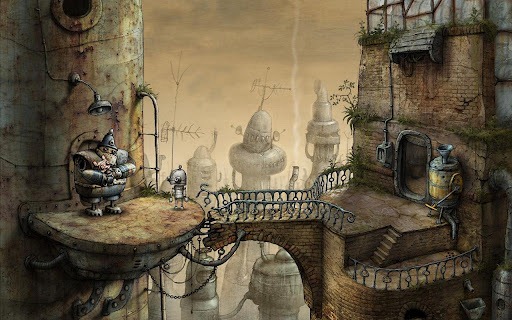
Amanita Design. 2009.[online image]. Available from:
http://www.androidpolice.com/2012/05/11/new-game-machinarium-combines-puzzles-mini-games-and-a-beautiful-award-winning-art-style/
Puzzle point-and-click adventure video game developed by
Amanita Design. They have received Aesthetics Award at IndieCade 2008 and Excellence in Visual Art award at the Independent Games Festival 2009. Artwork in this game is fully hand drawn, based on pencil drawing style and immitates traditional Chech cutout animation.
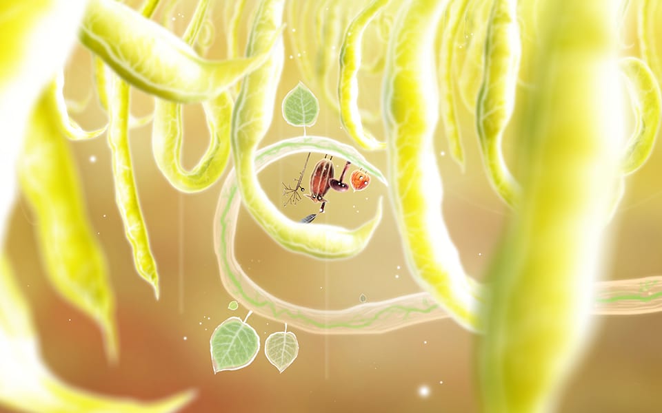
Botanicula
Amanita Design. 2012.
Botanicula. Microsoft Windows. Amanita Design & Daedalic Entertainment
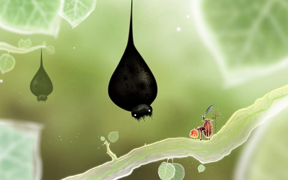
Amanita Design. 2012. [online image]. Available from:
http://amanita-design.net/games/botanicula.html
Another point-and-click adventure from Amanita Design. This game won a number of awards and one of them is the Story/World Design at IndieCade. Amanita Design keeps standing out with their artistic style every time they release a game. This particular game has a very graphic and stylised look with some fascinating, funny and 'cute'character designs. Game designers and artists sought inspiration from nature. By using photography not only for reference images but also 'textures' within game environment showed that experimenting with different media and art can produce some really creative results.
Ballpoint Universe - Infinite
Arachnid Games. 2013.
Ballpoint Universe. Microsoft Windows.Arachnid Games

Arachnid Games: Leo Dasso. 2013. [online image]. Available from:
http://www.rockpapershotgun.com/2014/01/06/wot-i-think-ballpoint-universe-infinite/
It is a shoot-em-up adventure game designed and created by artist Leo Dasso. All art is drawn using ballpoint pen. Ballpoint Universe - Infinite game certainly stands out with its artistic style. I would say, a very unique style. I think Leo Dassos' creativity does remind me some what Amabita Design approach, when inspiration is drawn from something very simple: in this case - ballpoint drawings.
Cosmic Couch
Lunavark Studio.
Cosmic Couch. Developed during Dare To Be Digital 2013 competition
 Lunavark Studio
.2013. [online image]. Available from:
http://epiclone.blogspot.co.uk/
I decided to mention this game because I really liked it and I think it certainly stood out from the rest of the teams. Game style reminded a book illustration or an animated movie. Lunavark team consisted of 4 students from Norwich University of Arts and a single programmer student from Abertay University. They have won an Artistic Achievement Award during the Dare ProtoPlay competion. You can see their game trailer video
here.
Luna Vark.2013.
Cosmic Couch Trailer (Dare To Be Digital 2013). [online].YouTube. Available from:
http://www.youtube.com/watch?v=Db2NANqp_IM [Accessed 10 August 2013]
Spider: The Secret of Bryce Manor
Tiger Style. 2009.
Spider: The Secret of Bryce Manor. iOS.Tiger Style

Tiger Style. 2009. [online image]. Available from:
http://www.pocket-lint.com/news/118056-aotd-spider-secret-bryce-manor/gallery
It is a side-scrolling action puzzle video game developed for iOS and Android platforms by American indie game developing company Tiger Style. Randy Smith and David Kalina try to produce quality and original games. Hand drawn artwork tries to create mystical atmosphere of the game. I think this games artwork is nice and sites well the story an possibly the game play however Machinarium (which seem to have a similar art style) looks much better. I do not think developers of this game put as much effort in to the artwork production as the Amanita Design guys.
The Howler
Antanas Marcelionis and Rene Petruliene. 2013.
The Howler. Android.

Rene Petruliene. 2013. [online image]. Available from:
http://www.desura.com/games/the-howler/images/screenshots-of-the-howler7#gallerylist
The Howler is a game released by a Lithuanian indie game developer for iOS, Android, PC and Mac. It features simple had drawn art created created by Renė Petrulienė. Since this game has been inspired by a novel 'Hour of The Wolf' by Andrius Tapinas it is not surprising that the art style looks very steampunk. Story takes place in 1905 in imaginary Vilnius (capital of Lithuania). I love this games art style. It is simple, has a somewhat rustic feel to it that complements the game idea. It also stands out from majority of the games out there and the combnation of gameplay, sound and art style gives a nice feeling of satisifaction when playing it.
About Love, Hate and the other ones
Black Pants Game Studios. 2012.
About Love, Hate and the other ones. iOS/Android. Black Pants Game Studios

Tobias Bilgeri, Black Pants Game Studios. 2012. [online image]. Black Pants Game Studios. Available at:
http://blackpants.de/about-love-and-hate/ [Accessed: 19 January 2014]
This is a game for mobile devices developed by Tobias Bilgeri (works at
Black pants Studios, Germany) as part of his graduation project at the School of Fine Arts Kassel. In this game you play 2 characters at the same time: Love and Hate and use their abilities to navigate through different maze worlds. One of the main reasons why I have decided to mention it here is because this game is fully hand drawn. I would probably say that it may not be as artistically accomplished as some of the previously mentioned games, however there is that undeniable 'rustic' hand painted feel to it which make this game to stand out from the crowd.
Game play trailer can be viewed here:
http://www.youtube.com/watch?v=FG0IVLlCrJU
3D games:
Ōkami
Clover studio. 2006.
Ōkami. Play Station 2. Capcom

Clover studio. 2006. [onilne image]. Available from:
http://i.imgur.com/vx9tN6V.jpg
Ōkami is an action-adventure video game. It combines Japanese myths, legends and folklore. Game art style is inspired by traditional ink wash painting technique using watercolour cel-shaded visual style. Although first release version has suffered from poor sales it received critical acclaim. This game was able to show in 2006 that games can be more: they can also be art. In my opinion, considering technology that was available at the time It was a great achievement. One of the reasons why it became a success, in my opinion, is the point that game designers did not copy other games or other popular art forms at the time, they drew their inspiration from their own culture: story telling and traditional art and that way attempted and succeeded in creating something new and of cultural importance within video game genre.
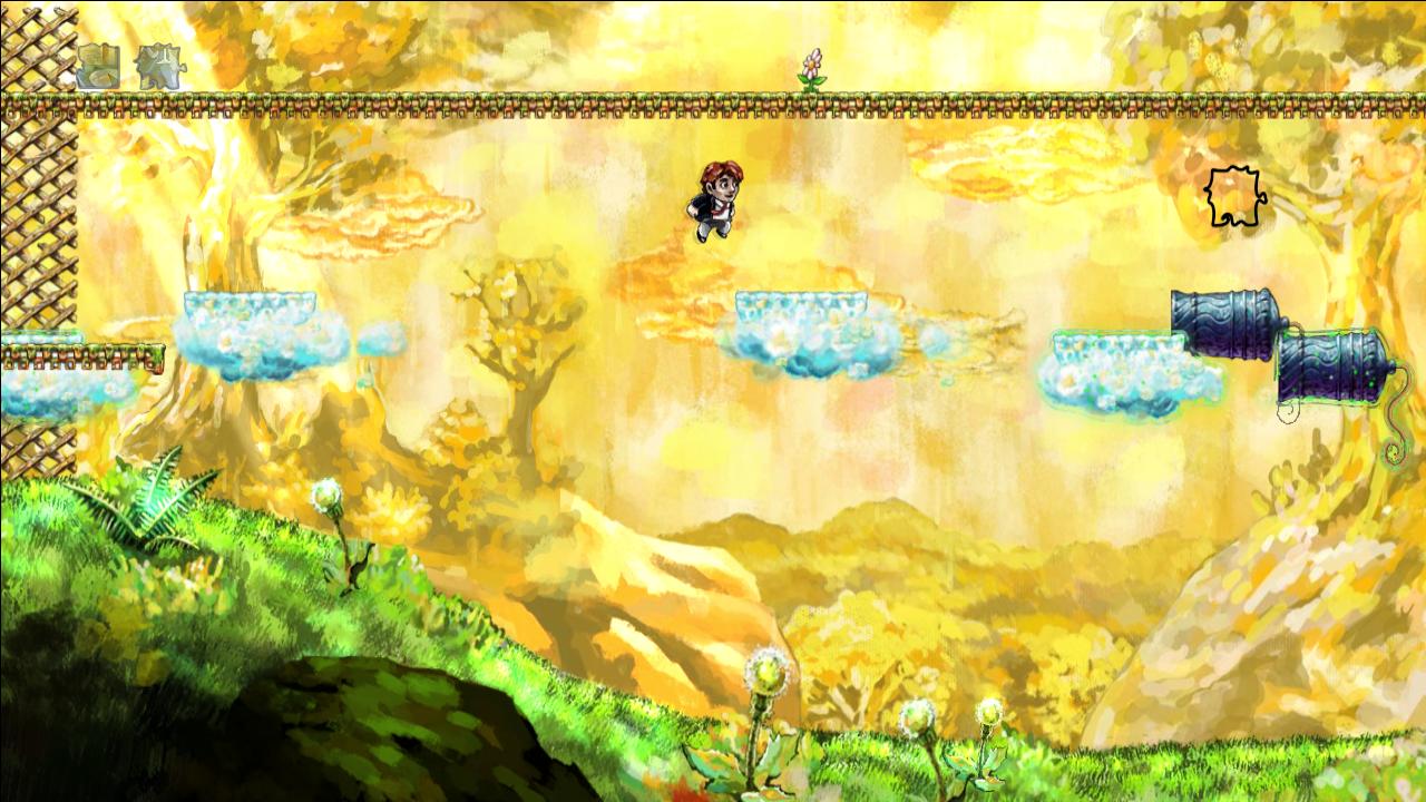
Journey
Thatgamecompany. 2012.
Journey. Playstation 3. Sony Computer Entertainment.

Thatgamecompany. 2012. [online image]. Available from:
http://media.edge-online.com/wp-content/uploads/edgeonline/2012/04/journey-game-screenshot-8-b.jpg
This is a 4th game created by Thatgamecompany. It is an adventure art game and a fruit of Jenova Chen's imagination. His idea was to try and evoke a sense of smallness and wonder within the game player. Aesthetic art in this game contributes to creation of a certain mood. Its minimalistic design was chosen to make the actual gameplay intuitive without any major directions. It received critical acclaim not only from critics but also from players. Some video game writers compared it more to art rather then a video game. It certainly have a great visuals and picturesque environment full. and just like in the movies colour within the game is used to convey the changing mood of the story.
Nice article about the game and the art within the game can be found
here.
Kevin Ohannessian. 2013.
Game Designer Jenova Chen on The Art Behind His "Journey".[online]. Fast Company. Available from:
http://www.fastcocreate.com/1680062/game-designer-jenova-chen-on-the-art-behind-his-journey [Accessed 28 September 2013]
Tiny & Big: Grandpas Leftovers
Black Pants Game Studios. 2012.
Tiny & Big Grandpas Leftovers. Microsoft Windows. Black Pants Game Studios
Tiny & Big: Grandpas Leftovers is another game from
Black Pants Game Studios. It is a jump and slice platformer with hand-crafted textures. It received an impressive array of awards for creativity, sound and visual style: a combination of 2D and 3D art that is not seen that often on the games market. In my opinion it certainly has a unique art style that is representative of this developer company. It somewhat reminds Okami in my opinion.
Love
Eskil Steenberg. 2010.
Love. Windows.
Eskil Steenberg. 2013. [online image]. Available from:
http://www.quelsolaar.com/love/screen_shots.html
Love is a MMORPG created by a Swedish developer and game critic Eskil Steenberg. Most of the game environment is procedurally generated. It reminds some what Journey since there is no predetermined gameplay. actual gameplay evolves during interaction with other players, NPC's and the game world. Although its a 3D game, it certainly has it own visual style that very much reminds of impressionistic art style. Its painterly look really stands out from the rest of the 3D games. Very innovative.
Can read more about the game here:
http://www.quelsolaar.com/love/index.html


.jpg)


