Showing posts with label colour. Show all posts

Sunday, 20 April 2014

Dissertation and some more dissertation

So for the last two weeks I have stopped doing any art and just concentrated on writing my dissertation. It is a very slow going process since English is not my first language so I often spend time looking at thesaurus trying to find that 'right' word that would describe better what I am trying to communicate.
I have changed a few bits in the overall layout of the paper.

I have also created an updated my project plan (Old one can be found in this blog post  here)showing the areas that I am looking at and how it all ties together (see image below).


I have added an area where I do traditional art and game art analysis; looking at Emotionalism aesthetic theory and how it ties together with brushstrokes visible on a canvas and how these marks not only connects the viewer and the artist but at the same time can contribute to the overall composition of the image. For example like guide the viewer’s eye around the canvas (see image below).


Van Gogh, V. 1889. Starry night. [online image]. Available from: http://en.wikipedia.org/wiki/File:VanGogh-starry_night_ballance1.jpg [Accessed 19 April 2014]


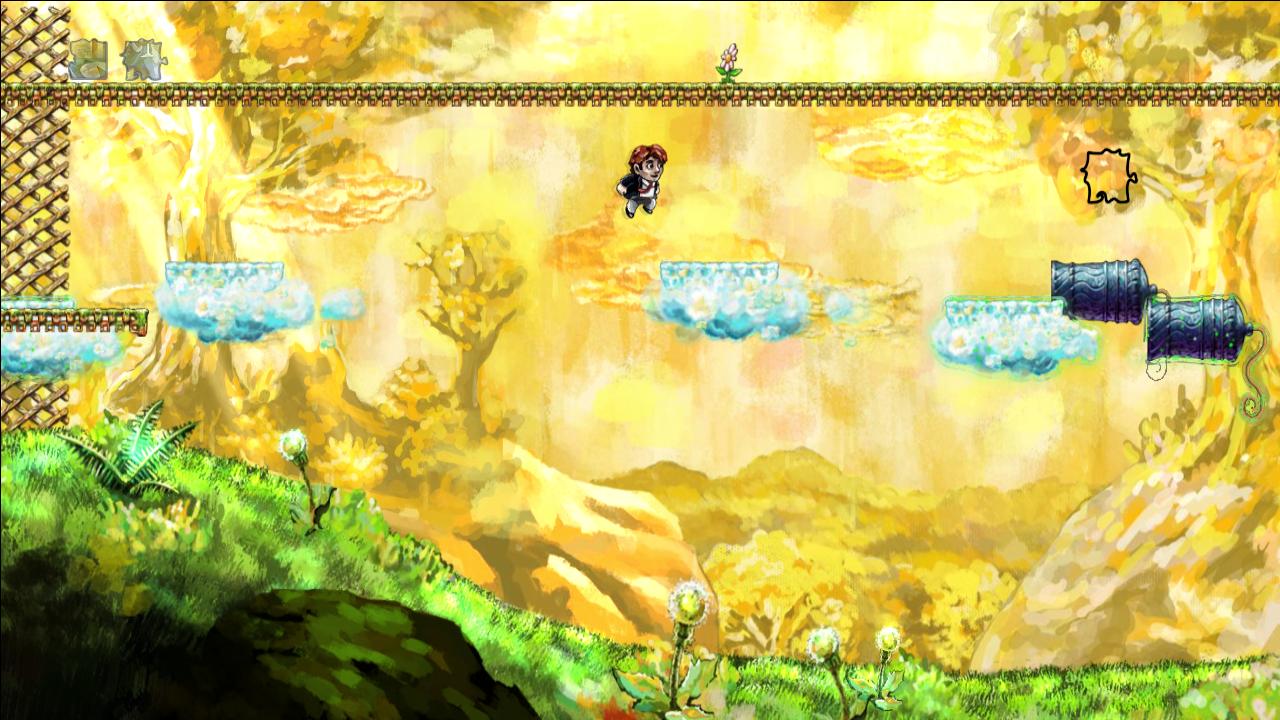
Also been looking about composition in games and so far Botanicula (2012) seem to be performing best (see image below).


Amanita Design. 2012. Botanicula. Microsoft Windows. Amanita Design & Daedalic Entertainment

A spore is spawned repeatedly on the top left-hand corner and is used to deliver a golden key (seen in the picture) to a spot in front of the characters on the bottom right-hand corner. Also the big brown mushroom on the top left-hand corner seems to 'balance' the characters standing at the bottom right-hand corner of the screen. There is also a light coloured white mushroom mirroring the big dark one.


Machinarium (2009) also have some composition elements. It seem to use primarily Golden Cut (see image below).


Amanita Design. 2009. Machinarium. Microsoft Windows. Amanita Design & Daedalic Entertainment

There is a lot action happening around the Golden Cut intersection. For example in this scene the main character Josef is in fiddling with the ventilation system/fan. Also tone wise the dark left-hand side is balanced by the light sky area on the right-hand side. The tower seen in the background is also going straight through the middle of screen.


Another area I am investigating is colour and I think there are some interesting examples how colour can make an asset stand out from the background (see image below).


Number None, Inc. 2009. Braid. Microsoft Windows. Number None, Inc


I think in Braid (2008) World 1, the clouds stand out well from the background because of the complementary colour use: yellow-orange (sky, background) is an opposite of blue-green (the interactable cloud platforms).


My supervisor has also suggested that in my dissertation I should talk about the experience of digital painting and how it is different from traditional painting.
I had also had a look at Walter Benjamin book 'The work of art in the age of its technological reproducibility'* as well as Grahame Sullivan book 'Art Practice As Research'**.
B. Walters although talks about printing of artworks and other ways of their mechanical reproduction do related to the Emotionalism aesthetics theory. G. Sullivan’s book was not as useful as I have thought. I did not have too much time to have a really close look at it so perhaps I have missed something. Sadly time is running out fast and I still have many things left to complete before submissions.
I really want to have my dissertation finished by 24th of April because that day I will be going to a library to get help with formatting, referencing and some other things related to dealing with long documents.


On a side note, this Thursday I have went to the Pixel Pushers exhibition at Hannah Maclure Centre and then attended Ian McQue's Masterclass. It was really interesting and I was hoping to get some insights or something really relevant to my project but I feel it was not worth the time as much as I have hoped. I think Jolomo Awards exhibition at HMC earlier this year was more useful.


* Benjamin, W.2008.The work of art in the age of its technological reproducibility and other writings on media.London: The Belknap Press

** Sullivan, G. 2010. Art practice as research : inquiry in visual arts. 2nd ed. London : SAGE

Wednesday, 26 March 2014

Fundamentals

I have bought an 'Art Fundamentals' book by 3dTotal (see image below) back in the end of December 2013 to refresh all the art fundamentals knowledge. Even though I have some other books related to this subject I have bought it because it was created by digital artist. The book contains many digital drawings and I thought it would be interesting to look at art fundamentals through the digital artist’s point of view. Also, all the paintings can serve as a good inspiration source for my projects work.


When I had some time I was doing some exercises in the book. Here are some of the things I have looked at:

Light and shadow


Starting image

Added key shadow

Added key light

Added cast shadow

Added reflecting light

Added key highlight

Added spot highlight

Added rim light

For this light exercise I have used some of my own custom brushes to give a bit of texture to the ball.


My final game idea is to have a low light scene in the forest light by the sunset sky, so obviously getting light and shadow areas right will help improving the overall image. Even though it is a fantasy world some basic things need to work (look realistic) to make since and light and shadow is one of them.


Colour was another area I wanted to refresh, as it will play a major part in my final work. Also mixing colours digitally is not the same as mixing them on canvas. It differs how it’s technically when using brushes, opacity and layer or brush modes but also do to the fact that is mixed on screen and within an environment of particular software (in my case Adobe Photoshop). For example the issue of mixing blue and yellow to create green with does not happen in an expected way when doing it digitally (There is a discussion o this topic in CGSociety forums: http://forums.cgsociety.org/archive/index.php/t-427907.html and can see an example of it in video that can be found here:  http://www.digitalartform.com/archives/2005/06/digital_color_m.html ) Also there is an issue about colour mixing in general even in traditional painting. Scott Naismith's YouTube Video where he actually explains the problem with RGB colour wheel: https://www.youtube.com/watch?v=jQqxN8LpGzw) (Scott Naismith is a Scottish landscape painter and a part-time art tutor at Reid Kerr College)


Colour wheel used by traditional media artist (mixing paint) Subtractive system.


Colour wheel when working with light (also on screen) Additive system.


Colour wheel

Complementary colours


Colour Hue

9 Value scale in black and white
and the same 9 value scale in colour (see image below)


And here is a CMYK colour wheel that works much better than a RGB


Scott Naismith.[No date].Colour Wheel Plain.[online]. Available from: http://scottnaismith.com/buy-online/product-category/resources/colour-wheel-for-artists/ [Accessed 10 January 2014]


* 3dTotal. 2013. Art Fundamentals: Color, Light, Composition, Anatomy, Perspective and Depth. 3D Total Publishing

Sunday, 23 March 2014

Finally got it!!!

After Last week’s presentation I have made a decision to continue with the oil/acrylic media look do to the facts that digital watercolour technique seem to be time consuming, especially when trying to get it to look right (as realistic as possible), also there is that layer issue mentioned in my last week’s post. I think oil/acrylic look is a bit of a safe option, but at the same time still very interesting one and not fully explored. In addition, there is a lot of practical information available online about digital painting in general and some of the digital artist (especially the ones that came from or also practice traditional media) now and again mention their use of certain techniques or types of brushes or other tools (e.g. Smudge tool) or ways of work on layers that are a little bit similar to traditional art. For exampleNykolai Alexander comes to mind. I've seen/read quite a few of her tutorials, and she seem to like using photographs of traditional media or even everyday patterns or textures for her custom digital brushes, as well as adding layers of some stains, or just smudges of colour and reducing their opacity to create a bit off 'mess'/'imperfection' to eliminate that 'digital polished look' in her own digital art. I do think that since human eye is trained to see patterns, facial features in various things, subconsciously we can recognise the repetition of brushes/brushstrokes that is visible in the digital art. I think subconsciously we might be able to recognise that there is something in-organic within the painting that is going on. But that is only my own theory and at the moment there is probably no point going in to it even if I really want to find out because I already have too many things going on.

So after I made up my mind about the media style and still was not happy about the previous attempt I've done a few more quick tests (see images below). I have wanted to see if I can find a better way of painting that looks more natural.


In the image above I was experimenting about leaving the black outlines and just layering the low opacity colours. It looked more like a watercolour then oil/acrylic so I decided not to continue with it.


In the image above I was experimenting with brushstrokes. How in a dark environment I could still possibly show some of the texture of the tree trunk.


Here I was trying to experiment with the sky: what brushes to use how it would work with the tree.


In the image above I was experimenting with a different kind of brushstroke.


I could feel it that there was something not quite right. The colour palette was what I wanted it to be and for some reason it was not working, and I had this issue with textures of the paint of the trees and the sky, how can I make them look different so they do not look boring but to still make it work. Something just wan not there and I was not happy.
I had to take some time off because my neck and my back were starting to hurt like crazy. After a day and a half I have returned back to the art and things just fell in to place. To help me along with the colour I did use an array of images that contained my desired colours and then just colour picked them and went on top with my brush covering everything that was there previously just keeping and mixing the colours I wanted. The same technique I have used it last year for the creation of animation background paintings. Also played some more with the colour dynamics on my brush. Below is an image I have managed to create and it just worked. I knew I got it! (see image below)


It just made me feel sooo good. Now just have to improve on it and make it things work better.


Now that I have the artwork on the way, I will also need to go back to the dissertation writing. During Crit presentation everyone was asked about their research and their dissertation. It certainly worked as a reminder to do the written work. I definitely need to go back to the aesthetics books as I really need to understand how I can tie it properly with the art that I am creating and digital 2D game art in general, and especially if I’m going to analyse art in my dissertation. It is still a very confusing topic to work ones head around. My plan is to complete the dissertation by the 21st of April with a few parts regarding my work missing and to be filled in later). I  do not like writing dissertation before my practical work is done but it has to be finished well before the submission because my supervisor needs at least 2 weeks to read it and give feedback.

Also need to make sure that I will have something to submit before 7th of April for the showcase reel.

On Thursday I had also been recommended to look at some art as practice books (e.g. Graham Sullivan 'Art practice as research') but so far I did not have time to do it.