Traditional Art and Media
Because the aim of this project is to try and reproduce qualities found in traditional art (general aesthetics, media texture/look, composition etc.) it is inspired an influenced by traditional paintings and drawings. Also, because traditional art is considered as having cultural value of meaning, it is in my opinion the most appropriate area to look for inspiration and learn from.
Oil/Acrylic painting
I really like oil paintings by Russian landscape artist Alexander Zavarin. Especially the impressionist alike ones, done using wide and bold brush strokes which ‘suggests’ objects within the painting but does not show any of the detail and that way leaving it to the viewer to figure out what it actually is. A.Zavarin manages to capture soft light within the scenes but at the same time creates illusion of space where colour either brings objects forward or moves them ‘deeper’ in to the canvas space. Paintings look chaotic yet manage to capture the actual mood of the scene. The artists’ brush strokes are very visible on the canvas and not only contribute towards the paintings mood but also emanates ‘personal touch’ energy from the work. This artist work is relevant to the project by providing not only inspiration for oil/acrylic paint look within digital medium, but also a possible solution to a problem where interactive objects should stand out from a background. Possible use of bold ‘brush’ strokes to only suggest some of the background objects can be the key. Also, keeping things interesting and letting viewers mind interpret some of the things that are happening on canvas can be used to bring more interest towards the game art. This traditional oil painting effect can be seen implemented as a 3D model texture in a ‘Damocles’ trailer for a new Crytec video game called Ryse: Son of Rome ( Trailer available at http://www.youtube.com/watch?v=czXJeJ9I2Us). (can see another post where I mention 'Damocles' trailer
here.)

Watercolour
Z.L.Feng is an international award winning Chinese artist living in U.S. Many of his watercolour landscape compositions can strike one as being rather dark and fairly minimalist at first however further inspection reveals an array of colours that have been achieved by the watercolour pigments blending together on paper. Intricate and dark tree branches are ‘set on fire’ by a multitude of colour dabs. Balanced compositions achieved by use of light and shadow as well as colours. This artists’ work is great as an inspiration as well as an example of watercolour media look: where every brush stroke leaves a permanent mark on canvas and the actual media has ‘luminosity’ unlike a heavy oil paint on canvas. This type of medium, if implemented successfully, has a possibility to help with keeping backgrounds simple and uncluttered and that way to help emphasize foreground and interactive objects. And just like in oil painting example mentioned above this media look can be used to bring more interest to the game art.

Collage
Collage is another interesting and widely used traditional art technique and a piece of art done by Nancy Standlee (see image below) is a fine example of this art style. This painting somewhat reminds an impressionist oil paintings with an explosion of bright colours and an array of bits of paper that resemble broad brush strokes on canvas. It is a nice colourful composition that conveys lively mood using ‘bold’ blocks of colour and at the same time have textural interest in each single piece of coloured paper that has been placed on the canvas. This technique can be recreated well in digital media if one wishes and can serve as a general motivation to perhaps be braver while exploring unusual places/arts/ art styles etc. for inspiration. In a certain way, collage is similar to what Amanita Design has done with their video game
Botanicula (2012)* art direction. more info in my
week 3 post.
Standlee, N. [no date].
Feed the Birds. [online image]. Available from:
http://nancystandlee.blogspot.co.uk/2011/02/rooster-and-bird-torn-paper-collage.html [Accessed 21 December 2013]
Digital Art
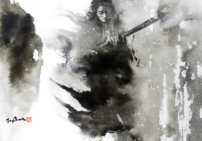
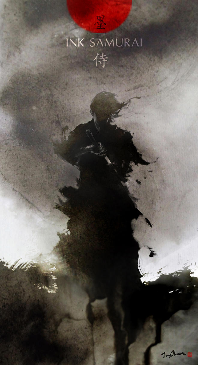
One of the most inspirational current ink artists that manage to almost flawlessly merge traditional ink medium with a digital Photoshop painting is Taiwanese artist Jung Shan. Rough paper texture and flowing ink is visible from his scanned/photographed ink paintings that are used as background for his final images. This gives an authentic, ‘personal touch’ to the digital drawing which is created using digital Photoshop brushes. Some of the paintings are made even more interesting by photographing ink painting while it is still damp (see image below). This artist work is a great example of how to blend traditional and digital media. Use of specific digital brushes that imitate traditional media techniques can be a great advantage in trying to recreate traditional media look in Photoshop.
I think this guy is absolutely amazing. Love the way he combines the traditional with the digital. It all looks so light and easy, done with a few brushstrokes. Amazing skills.
Videogames
Some videogame developers already tried to mimic traditional art styles and media within their games. It is good to see what has already been done and perhaps find out how.
Braid
One of the greatest inspirations to this project has been a video game called Braid (2008)**, created by Jonathan Blow. Braid is one of the important works in the video game industry because this game is a very first well known computer game that has been inspired by and tried to reproduce traditional art style. Game artist David Hellman’s (who is also a comic and graphic novel artist) inspiration has come from traditional art movements such as abstract art, impressionism, and surrealism.
Even though all the art assets had been digitally painted, on a closer inspection, while playing the game, one can easily see David Hillmans’ brush strokes throughout the painted backgrounds (see first image below) just like in all impressionist paintings done by famous artists. (see 2 bottom images by Claude Monet)
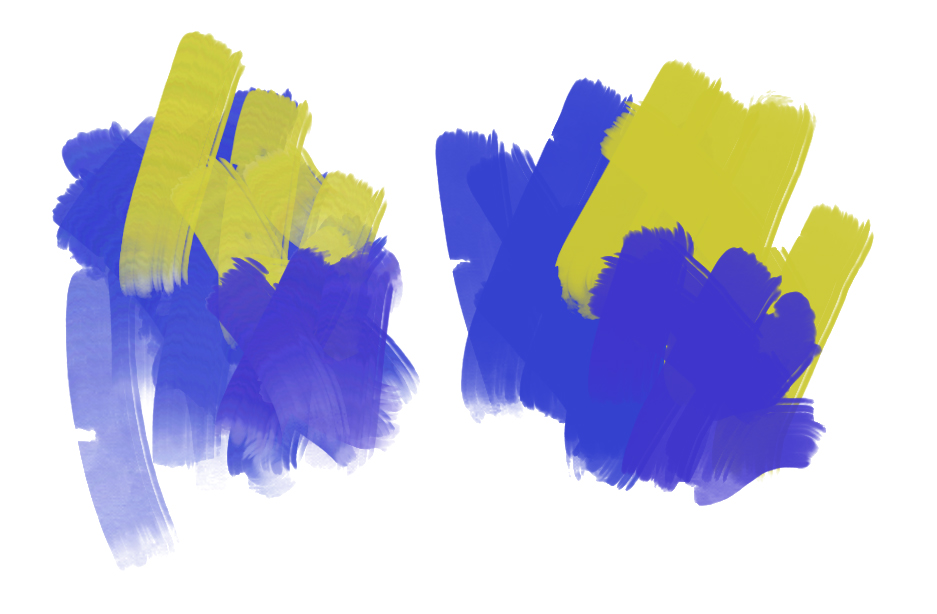
David Hillman chosen colours to create appropriate moods within the game that support the story and environment. Each of the game Worlds has its own colour palette. For example, within World 1 which is an introduction of the story, warm colours such as greens and yellows dominate the screen, while World 4 is a much more ‘cold’ looking environment with dominant blues and browns. Additionally, some of the elements within the game background where broken apart and implemented in to a particle system to create movement and dreamlike feeling similar to surrealistic paintings.
Also some of the background elements ended resembling watercolour or coloured ink painting on paper. (see image below)
Braid world has been crafted with a vision as well care towards the actual game player. One of the most inspirational quotes that also strongly relates to the idea and vision of this project is a quote by Braid developer Jonathan Blow has said:
“There’s a message in the visuals, and the effort that’s been put into the graphics. It’s a subliminal thing, a message which says that somebody really cared about putting this experience together...it says you’re in good hands” (Dennis, R., 2012) (Can find a link to the article in my week
3 blog post).
In my opinion, the subliminal things within this videogame are not only previously mentioned images inspired by traditional art movements or visible brush strokes that reminds us of traditional paintings done on canvas (e.g. Zavarin A. or Monet C.) but also some of the remainders of digital paint that can still be visible on some of the asset edges (see image below).
These left over ‘flaws’ or imperfections created by a human hand are picked up by the viewer irrelevant if the art is created on a real or a digital canvas and becomes part of the artwork that contributes to its aesthetics and in this case makes game art more personal.
I think this game is important to my project because it is a great example that traditional art can work in video games. In addition, the creation process through which David Hillman went while designing the art for this game is very informative and contributes a lot of knowledge towards this honours year project. (Can read David Hillman s blog
here.)
The Bridge
The Bridge (2013)*** is an only black and white 2D logic based puzzle game that is inspired by
Maurits Cornelis Eschers’ (Dutch graphic artist) work; game play and art style (see images below).
This game can be also considered as an important step in game design style because it picked a single artist as an inspiration and successfully created artwork that closely resembles the original. Ty Taylors’ (game designer) and Mario Castanedas’ (artist) goal for games art style was to attempt to replicate black-and-white lithograph style seen in majority of M.C. Eschers’ work. Therefore, even though art for the game has been produced digitally, it does have a traditional lithograph, mezzotint media look (see images below).
The Bridge game level art
In addition, game artwork somewhat reminds of Chinese ink painting (also mentioned in
week 5 blog post) as well as graphite pencil drawing (see images below).
The house
The tree
This game in my opinion is a great example where traditional art was used as inspiration and then was successfully transferred in to a digital medium.
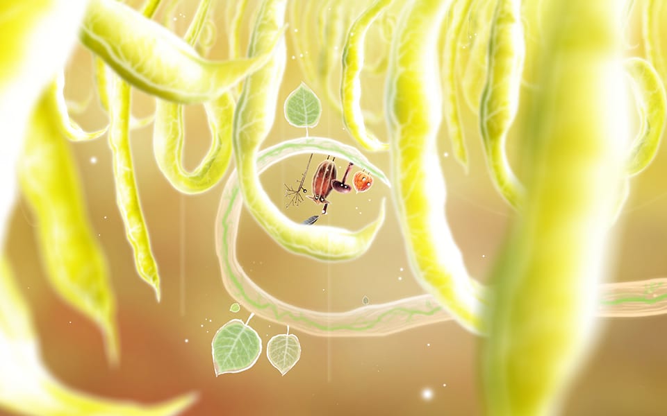
Botanicula
Botanicula (2012)* by Amanita Design games, stands out with its unique artistic style: very graphic and stylised look. I think this game project shows that inspiration can be found anywhere and merging different things, can result in some unique and fascinating design results (see Standlee, N. Feed the Birds image or even Jung Shan Wuxia Magazine cover image above).
Photography was used not only for preproduction phase as a material for character and environment design, but also as a texture material for both (see images below).
Amanita design. 2012. Botanicula: art book. p. 14. Amanita Design.
Amanita design. 2012. Botanicula: art book. p. 15. Amanita Design.
Game designers sought inspiration from nature. By blending it all together in a really creative way within game environment it resulted in a truly unique art style for a video game.
This example relates to honours year project by inspiring one to look ‘outside the box’ rather than drawing inspiration only from existing games/art.
I think it is important to get inspired by many different things because, in my opinion it is the best way to go about it while trying to create something interesting and unique not only from a game artist view but also a game players view. Since traditional art undoubtedly holds a key to aesthetics and 3D art nowadays has taken over in realistic representation, going back to the origins of traditional 2D art seems to make sense while looking for answers of a question ‘what else can be one with this medium?’
* Amanita Design. 2012. Botanicula. Microsoft Windows. Amanita Design & Daedalic Entertainment


.jpg)