I do not tend to play that many point- and-click adventure games these days but the ones I had a chance to look at are: The Whispered World (2009) and Memoria (2012) by Daedalic Entertainment and Botanicula (2012) and Machnarium (2009) by Amanita Design.
I chose these games because they resemble my game idea for honours year project and I have played them previously.
The Whispered World
The mouse cursor in a non-active state looks like in the image above.
The mouse cursor changes to a 'highlight' state (with a small blue light in the centre) when is placed above an interactable item. (see image above)
When clicked the cursor becomes active and opens up a context related menu where a player can select an action he/she wants to perform. (see image above)
An open inventory is made to look like an open bag/sack. It takes large part of the screen and contains all collected items. (see image above) Also, a general menu is hidden on the top right-hand corner. (see image above)
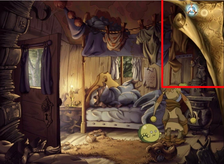
When a mouse cursor is moved towards the top right-hand corner the hidden menu reveals itself ( the corner peels away). The mouse cursor functions the same way as during game play: when placed above active item highlights the item in blue as well as lights up blue in the centre. (see image above)
Entrances and exits within the game are marked by a red arrow which appears only when placed above an entrance or exit. (see image above)
I did like a lot the look of inventory as well as the general menu being hidden in the corner of the screen. I think it gives an impression of an illustration; however I think the strange shaped mouse cursor feels a bit strange/unusual. Most likely because the convention in games as well as UI's in general seems to use something that reminds an arrow or a pointing finger. I think it's the shape of it that makes it feel strange at first.
This is another game released by Daedalic Entertainment. The developers seem to have changed the mouse cursor design for this game: the cursor takes a more traditional look of an arrow and a pointing finger icon that appears next to it when hovered above an interactable item. (see image below)
Inventory is hidden at the bottom of the screen and moving a mouse cursor to the bottom area reveals it (it slides up when opening and slides down when closing). Also game settings and questbook are located inside inventory (bottom right-hand corner). (see image below)
Botanicula
Very simple UI. Direction and some interactable objects being indicated by an arrow as seen in an image above.
The inventory slides down from the top of the screen and contains collectable cards icon as shown in the top left-hand corner of the screen as well as collectable items displayed at the top right-hand corner of the screen.
Machinarium
The game seems to be using the same Inventory principle as Botanicula (slides up and down when mouse pointer is moved to the top edge of the screen). Standard mouse cursor in a shape of an arrow and a pointing finger icon when above an interactable object. The collected objects are displayed on the top left-hand corner.
I think using standard arrow and pointing finger icons avoids confusion and looks very familiar to the player. If something else is used then best if design reminds an arrow or is in some sort of triangle shape. At least this is what I have encountered during my general video game play which is not limited by 2D point-and-click games mentioned in this post.
Amanita Design. 2012. Botanicula. Microsoft Windows. Amanita Design & Daedalic Entertainment
Amanita Design. 2009. Machinarium. Microsoft Windows. Amanita Design & Daedalic Entertainment
Daedalic Entertainment. 2013. Memoria. Microsoft Windows. Deep Silver
Daedalic Entertainment. 2009. The Whispered World. Microsoft Windows. Deep Silver


No comments:
Post a Comment